Carren Yeliandi / 0376990
Illustration & Visual Narrative / Bachelors of Design in Creative Media / Taylor's University
Task 2 - Composition
Lectures
Week 4
We were given a pdf file explaining colors and gradient by sir Hafiz on Whatsapp and a tutorial video on google classroom.
Week 5
We were given a lecture on perspective this week. Sir Hafiz gave us a pdf file on the subject on Whatsapp.
Week 6
No lecture as it is a Public Holiday (Deepavali)
Instructions
<iframe src="https://drive.google.com/file/d/1vHKGCfos9WO7vzQAuuPCKWP6CAwqYSez/preview" width="640" height="480" allow="autoplay"></iframe>
TASK 2 - COMPOSITION
1. SKETCH & REFERENCE
I've decided to use my vormator character "Sola" for this composition.
 |
| Fig. 1 Vormator character (25/10/24) |
Sola's lore or backstory is basically the give and take nature of magic as she wished for the creation of the world of her dream with the cost of the real world itself .
So to emphasize this I decided to make the composition divided into two parts, the colorful dream world and the crumbling real world.
 |
| Fig. 2 Composition Sketch (25/10/24) |
As seen on the sketch, the dream world mostly consists of colorful and childish looking clouds to symbolize her imagination.
 |
| Fig. 3 Refences used (01/11/24) |
 |
| Fig.4 Sketch submission (25/10/24) |
2. DIGITALIZATION
After the sketch and reference was approved, I cleaned up the sketch and then scan it.
I cleaned up the sketch with a one point perspective in mind where the clouds gets smaller the more closer it is with the earth so that it look more further away from the character.
 |
| Fig. 5 Scan of the cleaned up sketch (31/10/24) |
I then proceed to open illustrator and used that scan as the template and began tracing. at first I used the curvature tool but found it a bit hard to control.
 |
| Fig. 6 Attempt at the use of curvature tool (31/10/24) |
So I tried to use the ellipse shape and merge them, this produced the cleanest result but is too time consuming as I need to use multiple different circle or oval to make one cloud.
 |
| Fig. 7 Attempt at the use of Ellipse tool and merge (31/10/24) |
In the end I found that the pen tool is the easiest and fastest to use out of them all, so I used that tool to trace the entire sketch.
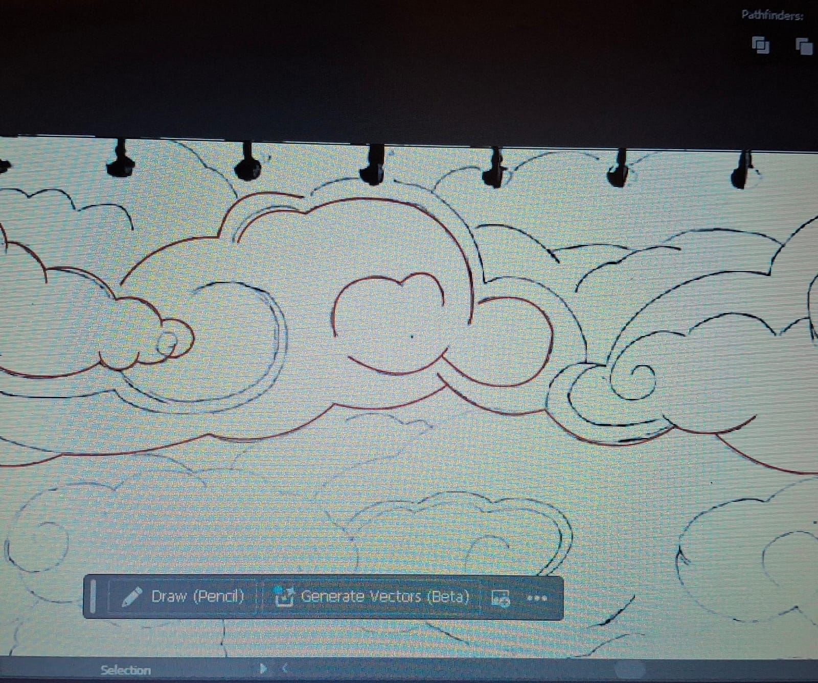 |
| Fig. 8 Attempt at the use of pen tool (31/10/24) |
As I traced the sketch, I decided to move a few clouds so that the perspective is more visible.

3. COLOURING
After the outline was finished, I went to fill in the shape. However, I faced some difficulties here as the shape isn't actually connected making the fill incomplete.
 |
| Fig. 10 Technical difficulties at the coloring process (01/11/24) |
Not wanting to restart from the beginning, I decide to just add another layer of the same shape ,just connected, and fill that with color instead.
I also give the background a blue and white gradient so that there will be no space left uncolored.
 |
| Fig. 11 The colored in shape (01/11/24) |
After that was finished, I started to experiment with the gradient. I used the color that is more or less similar to the reference and color palette I've chosen.
The first trial is good however the color doesn't make the perspective pop.
 |
| Fig. 12 First attempt at gradient (01/11/24) |
The clouds still looked a bit off so I moved one of the clouds on the right (the one with the purple color on the picture below) to cover up the top part of one of the cloud to emphasize that it was closer to the character.
.png) |
| Fig. 14 Cloud placement (01/11/24) |
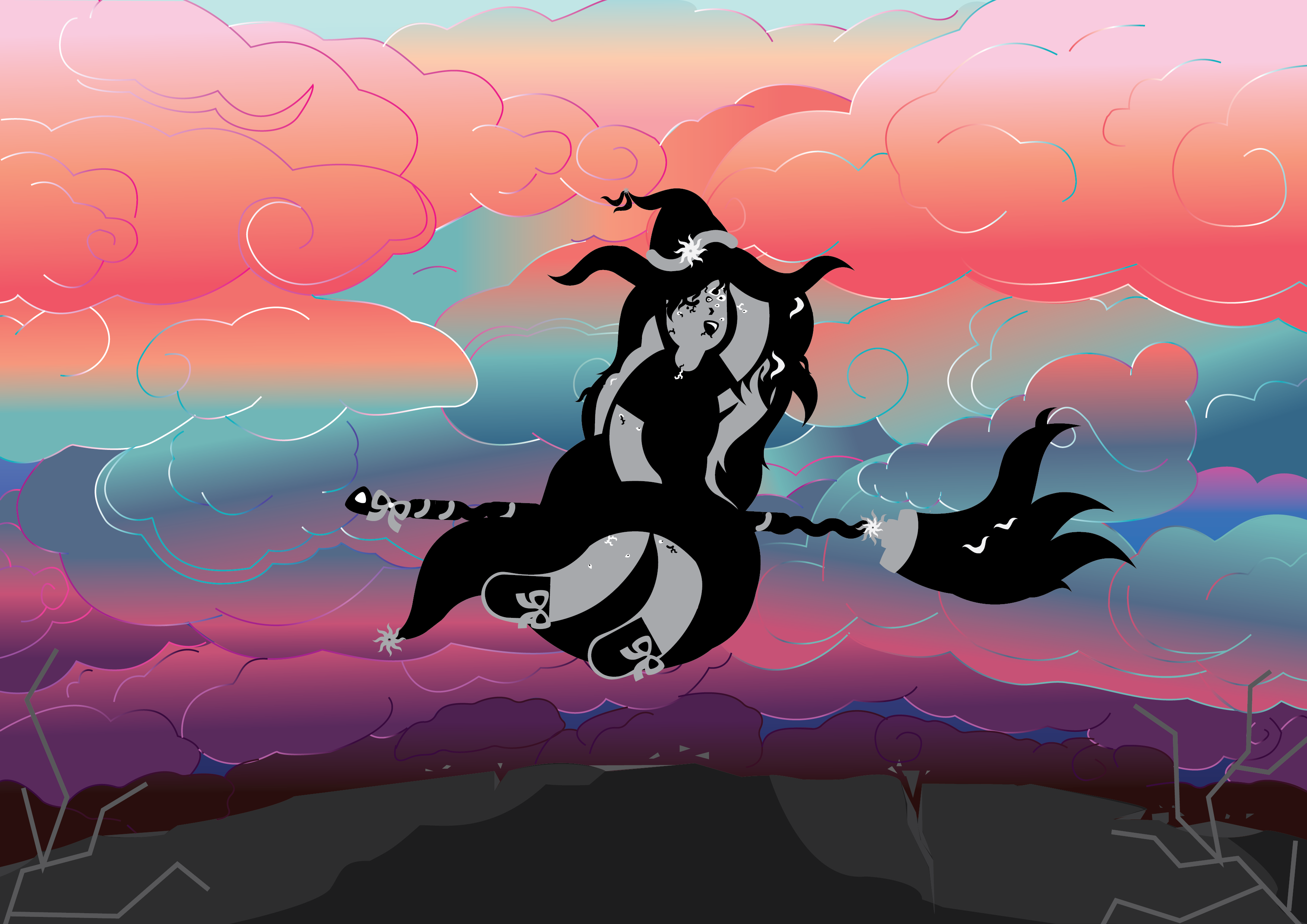
This gradient, in my opinion, emphasize the perspective a bit more so I went with this one instead.
I also used the gradient to color the outline to give it a more detailed look while still fitting in the composition and changed the background gradient from a darker to a lighter blue.
 |
| Fig.14 Final composition result (01/11/24) |
We were required to submit a pokemon card of our character, so I went ahead and used a dark element pokemon card for my character.
 |
| Fig. 15 Pokemon card template (01/11/24) |
For the weakness, I put the light element in as it is the opposite of the dark element. While for the resistance and retreat I just put in a random element as I didn't exactly understand how a pokemon card work.
 |
| Fig. 16 Sola's pokemon card (01/11/24) |
 |
| Fig. 17 Task 2 Moodboard (01/11/24) |
I have realized too late that I forgot to rounded up some of the edges in the clouds, so when I was given another opportunity to fix them I did them as soon as I can.
 |
| Fig. 18 Revised Final Composition PNG (07/01/25) |
 |
| Fig. 19 Revised Final T2 Concept Board PNG (07/01/25) |
 |
| Fig. 20 Revised Pokemon Card (07/01/25) |
Comments
Post a Comment