04/11/2024-22/12/2024 (Week 7 - Week 14)
Typography / Bachelors of Design in Creative Media / Taylor's University
Task 3
Typography / Bachelors of Design in Creative Media / Taylor's University
Task 3
Carren Yeliandi / 0376990
TABLE OF CONTENTS
Lectures
-
(There is no more lectures)
Instructions
<iframe
src="https://drive.google.com/file/d/1UBjSIl3kXa8sAupQgwWNjhNyr9z9nx_D/preview"
width="640" height="480" allow="autoplay"></iframe>
TASK 3 - TYPE DESIGN & COMMUNICATION
TASK SUMMARY
"Design a new fonts using a selected amount of westerns alphabets (o,l,e,d,s,t,h,i,g,n,c,'.';',';'!';'#') then input said font into fontlab and make a black and white poster using the font"
(Page 11)
1. Lettering
We were first tasked to try out some pens (3mm or up) on a millimeter
paper with each pens making at the very least 3 different styles.
Before I went ahead and write some letters, I tasked myself to learn how
to use the pen so that it feels natural on my hand first.
 |
| Fig.2.1.1. Figuring out the pens (22/12/24) |
After I felt like I got the hang of it, I went ahead and created
different style of font for the letters that were already chosen for us
which is "o,l,e,d,s,n,h,t,g,i,c" (which spelled out 'the design school')
and also a comma, a period , an exclamation mark and a hashtag.
 |
| Fig.2.1.2. Trying out different styles of font using different type of pens (22/12/24) |
At first I wanted to do the bubbly looking font but then decided to make a somewhat sharp looking font that looks like it's being carved out instead.
.jpeg) |
| Fig.2.1.3. The first font that I chose (22/12/24) |
.jpeg) |
| Fig.2.1.4. The font that I went with instead (22/12/24) |
 |
| Fig.2.1.5. Trying out different letters outside the one that was needed (22/12/24) |
2. Dissecting
We were then tasked to dissect "H,o,g,b" from a font that looks similar
to the one we chose and we were to only use a circle and a line to do
it.
I chose the 'Bembo Std' and then proceed to dissect them.
Based from my observation, the letter o is not a perfect circle but more
like an oval hence the use of multiple circle for this letter. However,
out of all the letter to be dissected, this one is definitely much more
easier. The left side of 'o' is also slightly smaller. So in conclusion,
the letter 'o' is asymmetrical.

|
| Fig.2.2.1. The dissection of the letter 'o' (22/12/24) |
The letter H, consisted of mostly straight lines but to make the serifs
which had a curve, we needed to use a few circle to make the curve
right. After comparing the width of the space from each lines, I found
that despite the side sharing the same width, the serifs were not as not
the upper serif is more shorter so they were not aligned.

|
| Fig.2.2.2. The dissection of the letter 'H' (22/12/24) |
The letter b uses a lot of circle for the 'bowl'. I suspected it was
somewhat a cut oval or circle but was proven wrong as it was curved more
at the lower part of the 'bowl'.

|
| Fig.2.2.3. The dissection of the letter 'b' (22/12/24) |
The letter g was tedious to make as it required a lot of circles for the
curves. I thought that I could use the same dissection as the letter o
for the top part of the letter g but was proven wrong when I went ahead
and tried to copy-paste it on it as it was somewhat slightly wider than
the letter o.

|
| Fig.2.2.4. The dissection of the letter 'g' (22/12/24) |
3. Digitizing
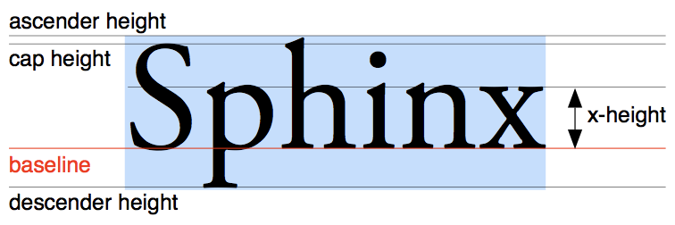
The first thing I did was creating a guideline to make my font
(Ascender, Cap line, X height, Baseline, Descender).
|
|
Fig.2.3.1. The needed guidelines (22/12/24) |
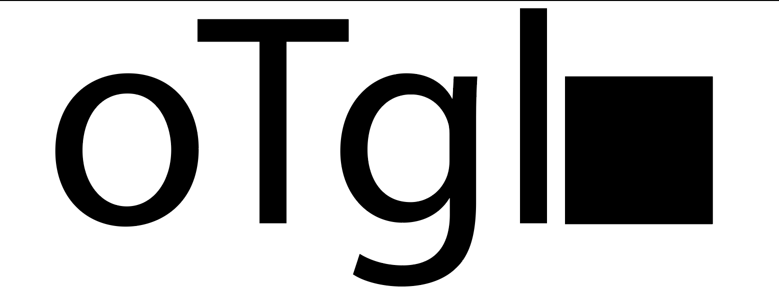
I chose 'myriad pro' as the base and typed out 'T,g,o,l" then made a
square (500x500 px) as the x height and baseline then sized up the text
(specifically the letter 'o') to fit the x-height and baseline.
|
| Fig.2.3.2. Myriad Pro font as the base guideline (22/12/24) |
I then grabbed the guidelines from the ruler and position it based on
the font Ascender (the letter 'l)', Cap line (the letter 'T') and
Descender (the letter 'g').

|
|
Fig.2.3.3. Myriad Pro font as the base guideline (22/12/24) |
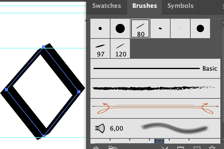
There were two ways to make the font, by using shape or using pen tool
and changed the brush based on the type that was used. I decided to
proceed with the latter.
|
|
Fig.2.3.4. The brush that was used (22/12/24) |
I first did a sample of the letter 'o', 'l', and 'e'.

|
|
Fig.2.3.5. The first three letters that was made (22/12/24) |
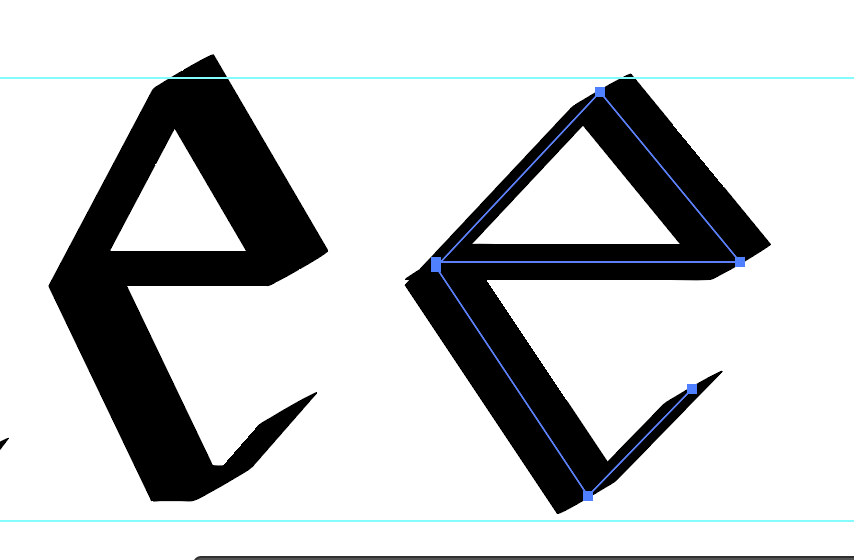
I decided that it was a little too sharp and rounded the corner slightly
and the 'e' was too small so I made it wider to fit in with the 'o'.

|
|
Fig.2.3.6. The first three letters that was made rounded vers.
(22/12/24) |
After that minor adjustment, I proceeded to make the other letters and rounded the edge slightly.

|
|
Fig.2.3.7. The first font design (22/12/24) |

|
||
Fig.2.3.8. Before revision (22/12/24)
|


|
| Fig.2.3.9. Path -> outline stroke to make a shape (22/12/24) |

|
| Fig.2.3.10. Revised design outline (22/12/24) |

|
| Fig.2.3.11. Pathfinder -> combine to make it into one shape per letter (22/12/24) |

|
| Fig.2.3.12. Revised vers. combined shape (22/12/24) |
I was considering to widen the 'e' to make it the same size as the o and decided to do so.
|
| Fig.2.3.13. Left : Before revision ; Right : After Revision (22/12/24) |
After feedback (Week 9), I realized that my approach to digitizing this
was wrong and decided to remake it but this time only making the letter
'o' and 'l'.
After that I used those two element to create the other letters so that
it has the same elements as it belongs to the same family and should
look similar.

|
| Fig.2.3.14. Second font design (22/12/24) |
It looks too thin to me so I made the stroke larger.

|
| Fig.2.3.15. Top : before ; Bottom : After (22/12/24) |

|
| Fig.2.3.16. The brush that was used (22/12/24) |
After another feedback from week 10, I fixed the width of the letter 'n'
and 'h'.
I also fixed the look of the letter 's' itself by using two 'o's that
has different size and putting them together to make somewhat like an
'8' but the upper 'o' is slightly smaller to make it look like the same
size.

|
| Fig.2.3.17. Second font design revision 1 (22/12/24) |
After that, I took a look at the Instagram video that was given to us by
Mr.Vinod and made a period and comma based on that video.
I decided to make a diagonal line as the comma and made it by stacking 2
period together and joining them together.
The period was made using the same dot for the i just slightly larger.

|
| Fig.2.3.18. Second font design revision 2 (22/12/24) |
I also adjusted the letter 's' a little to make it look more wider as I
felt like it looks too small.

|
| Fig.2.3.19. Top : Before ; Bottom : After (22/12/24) |
After I was satisfied, I asked for another feedback where it was pointed
out that the comma should just be a straight line instead.
The exclamation mark was also made smaller on the bottom part instead of
it just being a straight line.

|
| Fig.2.3.17. Second font design revision 3 (22/12/24) |
After that was fixed, I was good to go to Fontlab.

|
| Fig.2.3.18. Final CY(Carren) Regular Font JPG (22/12/24) |
<iframe src="https://drive.google.com/file/d/1uH1Yojle8-HTmFQruvBHxBfA4Btzmq26/preview" width="640" height="480" allow="autoplay"></iframe>
Fig.2.3.19. Final CY (Carren) Regular Font PDF (22/12/24)
4. Fontlab
Before going to Fontlab, I made sure to clean up most of the unneeded
anchor points.

|
| Fig.2.4.1. Anchor points deletion (22/12/24) |
I just followed the tutorial video that was given and measured the
Ascender, Cap line, X-height, Baseline and Descender using the shape
tool (Measuring starts from the baseline (0)).

|
| Fig.2.4.2. Measurements (22/12/24) |
Ascender Line = 730,08 px
Cap Height = 693,36 px
X-Height = 500 px
Baseline = 0 px
Descender Line = -212,76 px
After that it was quite straight forward as you just needed to copy and
paste the letters in (make sure the preferences on the paste and
duplicate setting was set to the right settings) and moved it around as
needed.
After I acquired the needed measurements, I went ahead and inputted it
in the font settings.

|
| Fig.2.4.3. Measurements settings (22/12/24) |

|
| Fig.2.4.4. Paste and duplicate settings (22/12/24) |
I did have a little issues with a few letters and I also couldn't find a
few of the symbols at first because it was kind of scattered around but
I manage.
 |
| Fig.2.4.5. Inputted letters into Fontlab 7 (22/12/24) |
After that I started kerning. However after feedback, I realized that I
was kerning it wrong as I was kerning a lot of them individually and
started to kern it based on the instructions given on teams.
 |
| Fig.2.4.6. The wrong way to do kernings (22/12/24) |
 |
| Fig.2.4.7. Instructions on how to do kerning on lowercase letters (22/12/24) |
I also got feedback to not make the space between the letter 'o' and 'n'
too wide.

|
| Fig.2.4.8. 'o' and 'n' Kerning (22/12/24) |
After the letter 'o' and 'n' was kerned, the other letters just needed
to be kerned based on those two letters.

|
| Fig.2.4.9. Other letters Kerning (22/12/24) |
 |
||
Fig.2.4.10. Some individual kerning (22/12/24)
|

5. Poster
After I was done kerning, I quickly went to make a poster.
I did not know which quote or words I should use so I just went to
ChatGPT to ask them to make me a quote using those letters. It was semi
successful as they kept using other letters but I was able to change
them into something else.

|
| Fig.2.5.1. First poster design (22/12/24) |
|
| Fig.2.5.2. Second poster design (22/12/24) |
I decided to use the second quote. I had decided to make the background
black to symbolize the word night.
I also decided to add three periods on the end of each words just to add
drama before I realized that I haven't added periods to my font so I
quickly fixed that and added those periods.
 |
| Fig.2.5.3. Inputting the period into my font (22/12/24) |
I adjusted the kerning a little to make each of the period closer
together just for this poster as the original spacing is already good
for me.
During the making of the posters, I realized that I should have made all
the quotes the same size so I quickly fixed that.

|
| Fig.2.5.4. Second poster design revision 1 (22/12/24) |
After a few feedback regarding the quotes, I finally made one that is
adequate.
|
| Fig.2.5.5. Second poster design revision 2 (22/12/24) |
I added in the bylines but was pointed out by the lecturer that it
should've been 8pts only. I looked at the instructions and realized once
again that I made a mistake on the byline (the size and the needed
texts) and quickly fixes it.

|
| Fig.2.5.6. Second poster design revision 3 (22/12/24) |
I adjusted the bylines a few times but based on the feedback from
Mr.Vinod , I had decided to let it align with the texts on the side. In
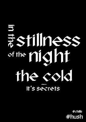
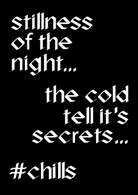
the end I finally made one that looks okay as my final poster.
I also went ahead to make a white one with just a slight difference.

|
|
Fig.2.5.7. Final Poster Design Black JPG (22/12/24) |
<iframe src="https://drive.google.com/file/d/1FtJYpP1gApXkYLw9g9mBq2Idh91VO4Iy/preview" width="640" height="480" allow="autoplay"></iframe>
Fig.2.5.8. Final Poster Design Black PDF (22/12/24)

|
| Fig.2.5.9. Final Poster Design White JPG (22/12/24) |
<iframe src="https://drive.google.com/file/d/1eSLv_BtyoFHhBY4527e7LbvRu_3bSRcZ/preview" width="640" height="480" allow="autoplay"></iframe>
Fig.2.5.10. Final Poster Design White PDF (22/12/24)
Feedbacks
Week 8 (Independent Learning Week)
General Feedback : -
Spesific Feedback : -
Week 9
General Feedback : The letters are too inconsistent and the
letters in the sketch isn't the same size
Spesific Feedback : Make the letters in the sketch more
consistent by using the blocks as guidelines, the digitalized letters
are too incosistent with one being smaller than the other, it should
look connected, try using the same shape for the rest of the letters.
Week 10
General Feedback : The letters looks quite rigid, some are still
a bit inconsistent.
Spesific Feedback : The letter n and h is a bit wider than the
rest, the s doesn't look as similar to the other. The rest of the letter
looks rigid so the letter s may need a little bit more thought on how it
will look like.
Week 11
General Feedback : Everything looks fine, it can be proceeded
to fontlab
Spesific Feedback : All the letters are okay, the period and
the comma needed to be adjusted a little and the hashtag can still be
improved but overall it can be proceeded to fontlab 7
Week 12
General Feedback : Do not kern it individually, the only letters
that needed to be kerned individually are those that have special needs
such as the letter 'r'
Spesific Feedback : Make sure to follow the kerning instructions
that was given , lessen the kerning between the letter 'o' and 'n' then
the rest just need to follow those two letter.
Week 13
General Feedback : Pay attention to the instructions of what is
needed for the posters and make sure that even the smallest aspect flows
with the rest of the design
Spesific Feedback : Make sure all the words are of the same size
, make sure the byline is as instructed and make sure all the aspects
fits together as part of the poster design, also make them all align
instead of squished together on one corner.
Reflections
Experience :
I first thought that making a font was going to be hard and stressing. Although it was definitely hard but I didn't really thought of making the font as stressing. It was unexpectedly one of the chillest project I did this semester. The kerning part was definitely the most confusing though but once you get the hang of it, it's not as bad as it seems. The end result was okay, not my best but an okay one for me as I was not really experienced making my own font, this was my first one after all so it's definitely a special one for me.
I first thought that making a font was going to be hard and stressing. Although it was definitely hard but I didn't really thought of making the font as stressing. It was unexpectedly one of the chillest project I did this semester. The kerning part was definitely the most confusing though but once you get the hang of it, it's not as bad as it seems. The end result was okay, not my best but an okay one for me as I was not really experienced making my own font, this was my first one after all so it's definitely a special one for me.
Observation :
I have observed that some people fonts looks quite similar but still looks different somehow. Most peoples made either sans-serif or serif letters, but each fonts have each of the maker's own characteristic that makes it looks different. I also think more people starts asking for feedback compared to before as we started to feel more comfortable asking for opinions. Other than other people, I also observed the letter dissection that were given to us which looks easy to do hence why I left it to be done later but was actually super complicated to the point that my eyes burns. I see a few people complaining about it so I know that I'm not the only one.
Findings :
I found myself starting to enjoy this class. At the beginning everything felt like a chore to do but now I think I started to have fun doing these projects. Though I still found myself struggling with documenting each of my progress on these e-port blogs. I also have bad time management so I think that's also a factor. But other than that, I don't really have any issues. I also found that while fonts looks so simple, the truth was it was extremely complicated to make so I have a new-found respect for these font makers.
Further Reading
 |
| Fig. 5.1. Book Cover (22/12/24) |
 |
| Fig.5.2. Interpolation (22/12/24) WEEK 8 This page explains interpolation which is used to produce similar versions of the typefaces that depending on the purpose. This could be use to improve the details on the typeface. |
 |
| Fig.5.3. Rendering Environment (22/12/24) |
WEEK 9
This page talks about the importance of the rendering environment. Different printers produce different results even if the font used stays the same.
.jpeg) |
| Fig.5.4. Type Classification (22/12/24) |
WEEK 10
This page is just showing some of the type classification and identification mostly some basics one. This classification helps to identify typefaces considering how many typefaces in the world.
WEEK 11
.jpeg) |
| Fig. 5.5 The Golden Section and ISO Formats (22/12/24) |
WEEK 11
This page talks about 'The Golden Section' , a ratio or proportion that was said to create a harmonious relationship between elements on the page. It also talks about the ISO format which is basically talking about the paper size that we normally use (A1,A4 ;etc).
.jpeg) |
| Fig.5.6. Typography Selection (22/12/24) |
WEEK 12
This page talks about Typography selection as different typefaces has different purposes.
 |
| Fig.5.7. Space Matters (22/12/24) |
WEEK 13
This page talks about the importance of spacing between words to make it easier for the readers to read. A basic reading rhythm or pattern can boost the readability significantly.
Comments
Post a Comment