03/03/25 - 17/03/25 ( Week 5 - Week 7 )
Carren Yeliandi / 0376990
Bachelor of Design (Honours) in Creative Media - Design Principles - Taylor's University
Task 3
Table of Content
INSTRUCTIONS
<iframe
src="https://drive.google.com/file/d/1SrGwppJjJ8F-jq7Yml2kUXyJMyiz4Amr/preview"
width="640" height="480" allow="autoplay"></iframe>
"For task 3, we are required to design an artwork based of the improved
poster idea that we have chosen from task 2 and developed it by using the
design principles."
TASK 3
Chosen Poster :

|
| Fig 1. Original chosen poster without size adjustment (10/03/25) |
.jpg)
|
|
Fig 2. US OPEN 2022 COMMISIONED POSTER BY KEY DETAIL (10/03/25) |
Title : US Open 2022
Artist : Key Detail
Year : 2022
Medium : Digital Poster
Chosen Improved Idea :

|
| Fig 3. Chosen improved poster (10/03/25) |
Rationale (Fig 3) :
I wanted to emphasize the tennis
match to bring out the same good visual communication by using the
right image and word. There is use of principle of contrast by the
use of details and movements by the lines symbolizing fast
movements. The contrast creates emphasis on the tennis player and it
easily tells the viewer what US Open 2022 is. I also change the o in
the open to a tennis ball to further emphasize the point. (78)
After the feedback from week 5, I
went ahead with idea 1 (Fig 3). The first thing that I did was
transfer over the sketch into a digital platform (Procreate and
Ibispaint) to make a digital sketch (Fig 4) by tracing the scanned
sketch (Fig 3).
Using the rule of thirds, I moved the character and the tennis ball
so that it was positioned into a point on the rule of thirds. While
I was doing that, I also fixed some parts that I thought could be
improved such as the text placements and the audience on the side. I
also sketched out the opponent more clearly so that you can see his
figure.

|
| Fig 4. Traced digital sketch (10/03/25) |
After that I went ahead and cleaned
them all up into a cleaner line art all the while fixing some
details on the main character like the hair and the
racket/racquet.
.jpeg)
|
| Fig 5. Cleaner line art (10/03/25) |
Vid 1. Procreate process 1 (19/03/25)
However while I was observing the
finish result, I noticed that it looks a little weird and I went
ahead to ask some of my friends for feedback. Most of them said that
the main character body has a little problem and they gave me some
advice which I followed. They said that the body should be bending
but the way that I drew it make it seems so stiff so I made it more
curvier on the back to insinuate the bend of the body.
After that, Also fixed and added
some sponsor panel / half wall that stood in front of the audience
so that it fits more into the perspective that I'm making them. I
also added the extra text that I haven't added in in the previous
line art. The font is temporary as I will be adding them in later
using a different platform.

|
| Fig 6. Finished line art (10/03/25) |
After that was completed, I went ahead to think of some concept
with the coloring.
I could either color them the same
way that my chosen poster did which is by giving them shading in
simple shapes, basically coloring them like normal, and using
energetic colors mainly blue and yellow hues just in a different
shades. Blue and yellow are complementary colors to each other,
making it possible to have a high level of contrast while still
maintaining color harmony.
.jpeg)
|
| Fig 7. Blue color palette (10/03/25) |

|
| Fig 8. Yellow color palette (10/03/35) |

|
| Fig 9. Complementary colors (10/03/25) |
Or I can make them using a dark
blue and a bright yellow just like the figure below (Fig 10) To
create somewhat of a dramatic feel on the poster, somewhat like the
hope that the tennis player has to win the tournament.
.jpeg)
|
| Fig 10. Coloring concept using dark blue and bright yellow (10/03/25) |
The difference between the first idea and this idea
is that while both of them uses both blue and yellow, this idea
(Fig 10) uses a darker shade of blue and has a more darker look to
the poster due to it, while the first idea uses bright colors that
can also symbolize happiness and excitements.
After reviewing the final line
art again, I wanted to move the main character so that it takes up
more space like the original sketch did so that people can
actually see the pose the character is doing. I also wanted to to
the tennis court a little more to the left as it looks a little
too small.
The rest of the design can stay
how it is but I might also change the expression so that it
doesn't looks like he's struggling. This plan will stay on hold
until I get the lecturer feedback if I can proceed how it is
currently or I can do some changes as I have stated here.
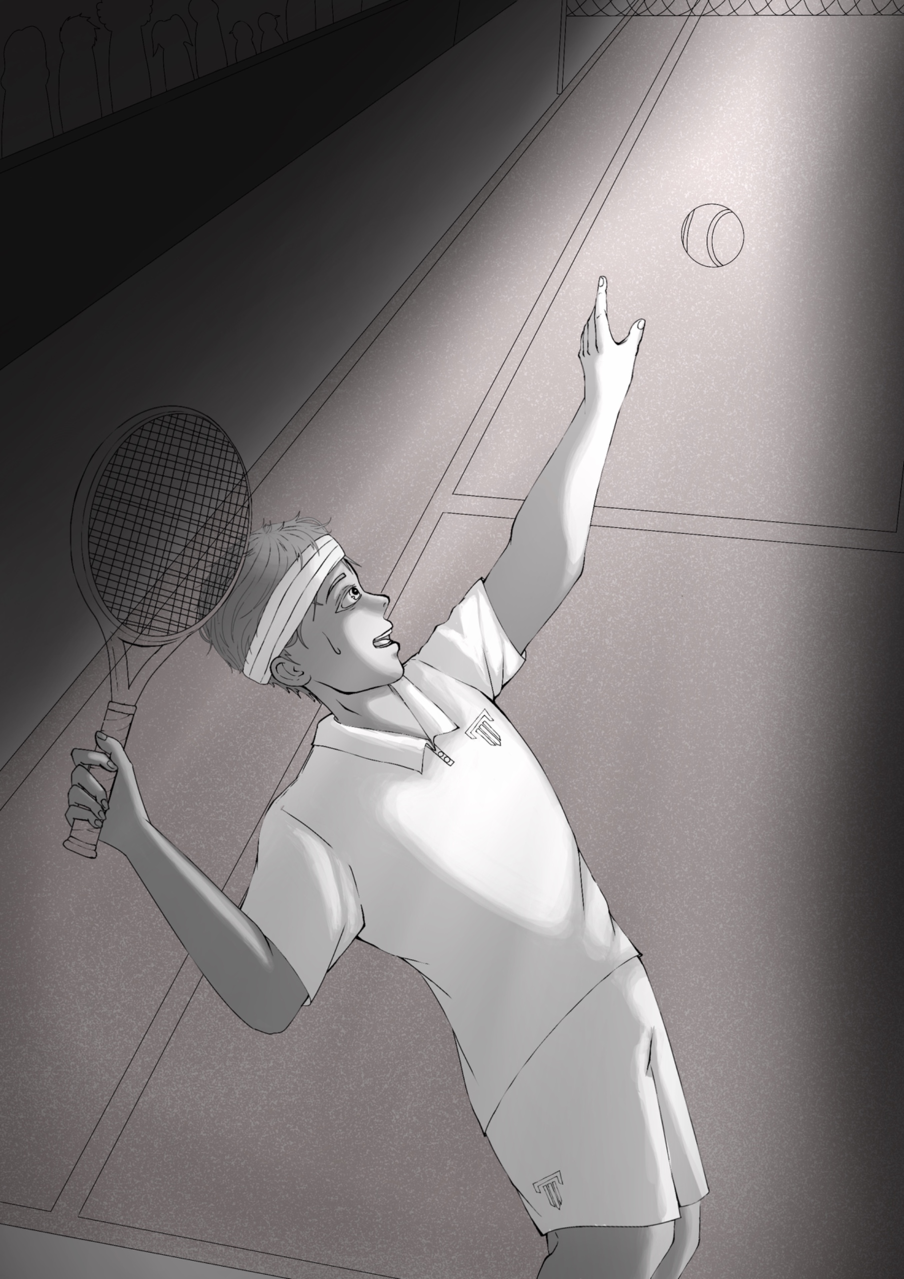
After the feedback from week 6, I
decided to went ahead and do all the changes that I have mentioned
before and also basing it on the feedback from week 6. I traced
the character again but this time I added line weights so that it
doesn't seem too stiff. I also fixed the perspective of the court
and erased the opponent. I also moved the main character to be
more bigger and be the focal point of the poster.

|
| Fig 11. Newer line art of my artwork (17/03/25) |
I thought about keeping the
opponent but when I tried it out, I didn't quite like it. It's
definitely a more detailed version of the poster but it takes
away the eyes from the main player as it was really crowded on
the top left.

|
| Fig 12. discarded background (17/03/25) |
I decided to first colored it in with
grayscale then overlaying it with the colors that I want, I did
this because I wanted the colors to have high contrast which I can
see more clearly if I used black, grey and white first.

|
| Fig 13. Grayscale coloring process 1 (17/03/25) |
I first layered on the base color
the added the shadow with a darker grey color and a blend mode
(multiply or linear burn), then I used the eraser and the brush
with lower opacity to create layers of color so that the lines are
not too harsh and it looks more blended while still maintaining
the hard edges.
I continued on coloring the rest
of the character before I decided to make the light source more
obvious by using white and the 'add' blend mode as the light and
black/grey and the 'multiply' blend mode as the shadow created by
the light. This creates emphasis and contrast, making the main
player the main focal point of the poster.
|
| Fig 14. Grayscale coloring process 2 (17/03/25) |
I fixed the lighting and the shadow a bit before deciding to add a small line of light to the character by using a lighter shade of grey from the base color of each parts and then using the 'linear light' blend mode. I then quickly moved on to the details like the racket, tennis ball and the audience.

|
| Fig 15. Finished grayscale coloring (17/03/25) |

|
| Fig 16. Finished grayscale with rule of thirds (17/03/25) |
After I was satisfied, I was
thinking on using the color palette that I have chosen previously
(fig 7 & 8) but I wanted to use a darker blue for the
background to create an even higher contrast.
For the yellow, I didn't find
anywhere to use it but the ball and the ball uses a fluorescent
green-yellow color akin to that of the usual tennis ball. But
since I wanted to emphasize the tennis player, I thought of using
the yellow on the shirt to contrast the character against the blue
court. I made the layer have a very low opacity as I didn't want
to have the shirt to look too yellow but have that yellowish hue
instead.

|
| Fig 17. Overlaying coloring process 1 (19/03/25) |
I wanted to use the darker royal
blue color to make an ever higher contrast, but it was too dark so
the lecturer advised me to choose a lighter color.
I also added the blue reflected
light (cooler color) on the back as the light should have been
reflected when it hits the ground. I also added a yellowish
(warmer color) shine on the ball to contrast against the blue
light and add more definition and make the light location more
obvious.

|
| Fig 18. Overlaying coloring process 2 (19/03/25) |

|
| Fig 19. Colors used in the final poster (19/03/25) |

|
| Fig 20. Overlaying coloring process 3 (19/03/25) |
After that was done, I moved it to photoshop to add the texts
however one of the number 2 on the '2022' was clashing with the
white lines and it didn't help if I used a darker color or a
lighter color it wasn't as readable as the rest of the text. But i
didn't want to change the color as I intentionally used the same
color as the tennis ball to give a sense that the tennis ball does
belong there as a replacement for the number 0.
.jpg)
|
| Fig 21. Poster with darker number 2 on the '2022' (19/03/25) |

|
|
Fig 22. Poster with lighter number 2 on the '2022'
(19/03/25) |
I added another layer of shadow on
the tennis player to give it more depth and moved the tennis ball
to the right a little more to give space for the number 2 as the
one before was clashing with the white lines and didn't look too
readable. I also added a white outer edge just as a finishing
touch. (This time I used Adobe Illustrator)

|
| Fig 23. FINAL ARTWORK (19/03/25) |

|
| Fig 24. Carren Yeliandi_US Open 2022_Task 3 (19/03/25) |
Vid 3. Procreate process 2 (19/03/25)
Rationale :
I wanted to make my poster to have a good visual
communication like the chosen poster that I wanted to improve as
to be able to tell the viewer exactly what this poster is meant
to convey and to not confuse the viewer on what the US Open is
actually is and which US Open that is happening as there are
many types of US Open.
As I wanted to keep the good
visual communication from my chosen poster, I decided to
emphasize the main tennis player by using the rule of thirds, a
part of the principle of balance, to balance out the poster but
at the same time making the main tennis player the focal point.
I also used the principle of contrast and emphasis on the poster
via the use of light and shadow to further emphasize the tennis
player so that the viewer of this poster will immediately
understand what this poster is meant for and what the tournament
is all about.
The colors chosen is a
complementary color which is meant to create a higher level of
contrast. Then there is also the principle of movement that you can see
from the curved pose of the tennis player that is about to serve
the tennis ball. I kept the audience in the back but in a
silhouetted manner to somewhat says that this is not a simple
tennis match but an actual tournament but kept it somewhat hidden
as to not take away the attention from the tennis player which has
became the focal point of the poster. There is principle of
proximity applied on the texts to give weight on which information
is more important and separate them. The proximity also makes the
title have a higher hierarchy and make the focus be more on the
title instead of the less important text on the poster. (312
words)
FEEDBACK
Week 5 :
Task 2 feedback.
Week 6 :
Good progress, think again if the opponent is needed. Maybe
make the extra information smaller and apply principle of
proximity on the extra texts. Try fixing the alignment and
hierarchy of the texts. Nice justification of colors.
Week 7 :
The text alignments could still be fixed, maybe move the extra
text to the bottom left away from the title. Continue on the
coloring but don't make it too dark, possibly try using the same
color palette as the chosen artwork as it has the right
energetic and sporty feels to it.
Comments
Post a Comment