22/04/25 - 30/05/25 ( Week 1 - Week 2)
Carren Yeliandi / 0376990
Interactive Design / Bachelors of Design in Creative Media / Taylor's University
Exercises 1
Carren Yeliandi / 0376990
Interactive Design / Bachelors of Design in Creative Media / Taylor's University
Exercises 1
TABLE OF CONTENTS
Lectures
-
Instructions
<iframe
src="https://drive.google.com/file/d/1uHHYgIaueTxzS5HII6T19UE2u5JfwPQa/preview"
width="640" height="480" allow="autoplay"></iframe>
Exercise 1 - Web Analysis
"Your task is to analyze 5 existing websites and identify areas for
improvement."
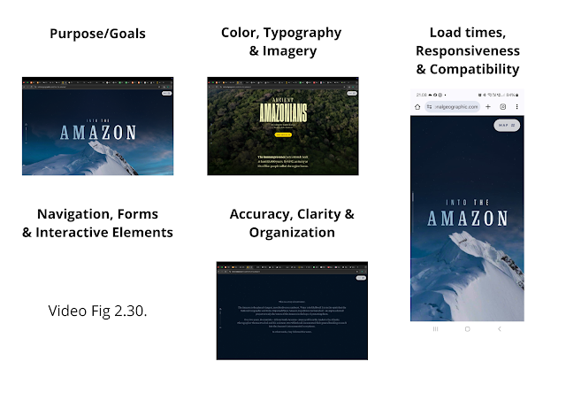
Analysis Requirements :
- Consider the purpose and goals of the website, and evaluate whether they are effectively communicated to the user. (The effectiveness of the design communication)
- Evaluate the visual design and layout of the website, including its use of color, typography, and imagery. (How it looks visually)
- Consider the functionality and usability of the website, including its navigation, forms, and interactive elements. (How easy it is to use)
- Evaluate the quality and relevance of the website's content, including its accuracy, clarity, and organization. (The website contents)
- Consider the website's performance, including its load times, responsiveness, and compatibility with different devices and browsers. (How fast it performs) -> Tested on Chrome, Firefox, Safari on desktop as well as Chrome on mobile phones.
Full Thoughts and Analysis :
- Consider the purpose and goals of the website, and evaluate whether they are effectively communicated to the user.
 |
| Fig 2.1. Clear purpose communication (Week 2 - 29/2/25) |
Purpose and goals : As the title mention, The website is
communicating the journey of exploring the amazon, hence "Into The
Amazon", following the waters from the top of the mountain, on
the part where it was mentioning this, They showcase the picture of
the mountain itself to emphasize the location even more, as seen at fig 2.1. This kind of
emphasis continue on throughout the entire website, so it's somewhat
like a storybook that can be interacted with. So in terms of
communication, I think this website is making it quite clear on what
it's talking about as the text and image continue to correlate to one
another to boost the communication of the story even further.
- Evaluate the visual design and layout of the website, including its use of color, typography, and imagery.
 |
| Fig 2.2. Typography, Color and Image (Week 2 - 29/2/25) |
- Consider the functionality and usability of the website, including its navigation, forms, and interactive elements.
Fig 2.3. Navigation, Interactive Elements, Forms (Week 2 - 29/2/25)
Usability : It's navigation is quite interesting, as I have mentioned
earlier it's like you're watching a story telling video just by
navigating throughout the website. They tell you what to do by putting on a little text that said "scroll" so people know how to navigate through the whole website. By using the cursor to scroll in
order to read the next part of the content, however it's not in a
singular line as it follows the way the landscape can be walked
through so it's as if we're there walking alongside the researcher.
Although it's sometimes a bit confusing as the speed of the scrolling
may differ per person and because there is nothing that can slow down the scrolling as it got to
the next part sometimes, it can accidentally cause the user to scroll past the
second part and instead on to the third part instantly so it's a bit
of a hassle to scroll back up again just to see what I had missed.
When you reach the end, it's basically somewhat a loop so it brings
you back to the beginning starting from the title without the first
introduction backstory. There's not really any forms as it's just an informative website and
the interactive elements is mostly located on the scrolling
navigations but there are also things like the map which you can click
to see icons that represent the location and main point of each part of the journey
along with a choices side bar that contains slight
description about each icons ,which you can click and see the
article explaining more on specifically that part of the story, it's
somewhat more easier to read than the main website as it contains
specific info with corresponding image and video and the scrolling is not as complicated as the main website so for people that just want the information rather than the full on experience, they can also just access it through there. There are also feedbacks when you hover on top of the call to action button, the yellow button while shine and have a line outside of it, indicating that you can click on it. While the white button just have the white line outside of the button.
- Evaluate the quality and relevance of the website's content, including its accuracy, clarity, and organization.
 |
| Fig 2.4. Accuracy, Clarity, Organization (Week 2 - 29/2/25) |
Contents : The content of this website is basically a documentation on their journey on exploring the amazon, each important location is highlighted in the map option on the top right corner that will open up into a sidebar that is full of information. The information inside the website is mostly directly quoted from the national geographic website that pop out when you type in 'amazon expedition national geographic', so it is quite safe to say that the information inside is accurate. While they did not directly put a source link, they did tell us from where and who did the expedition as well as the mentioning of the company name inside the gallery itself so we can safely assume where they did find the information. The storytelling is also quite clear as it is telling the story starting from where the journey started and continuing on depending on where they are going, the texts is readable because the fonts and colors chosen are suitable. The organization of the website is a bit too complicated to think about, but because of how the navigation works, it looks complicated but still somehow looks organized as the navigation leads our eyes on where the text starts so the reading flow are smooth.
- Consider the website's performance, including its load times, responsiveness, and compatibility with different devices and browsers.
 |
| Fig 2.5. Load times, Responsiveness, Compatibility (Week 2 - 29/2/25) |
Performance : The load time is fast just around 2-3 seconds, it's really fast if you consider how much the image changes each time you scroll, with that much animation the load time is usually a bit lagging however this website is very smooth if you compare to the usual. The response is also fast, anything I click ,it immediately brought me to that part with only around a second of loading or anything. Other than that, I tried opening it on Safari, Firefox and Chrome as well as on my phone, they load well and are compatible with every browser that I tried opening it on. On my phone, it's mostly the same but there is a certain part of the animation that will be lagging due to high amount of things going on there.
- Consider the purpose and goals of the website, and evaluate whether they are effectively communicated to the user.
 |
| Fig 2.6. Clear purpose communication (Week 2 - 29/2/25) |
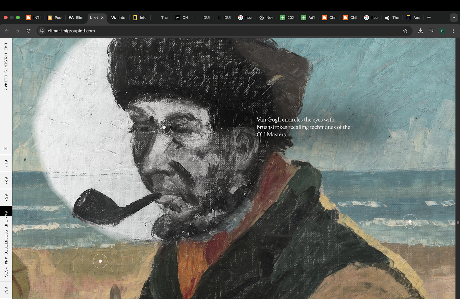
Purpose and goals : I read the title but I thought it was just some random word but I did know that this website has some correlation to Vincent van Gogh. After exploring the website, I found out that this website is basically explaining a certain painting created by Vincent van Gogh, 'Elimar'. With the story telling starting from the start of Vincent van Gogh to the part where he created the painting mentioned, it then goes on to the details on the painting and describing each detail that can be navigated. The purpose of the website is definitely communicated clearly.
- Evaluate the visual design and layout of the website, including its use of color, typography, and imagery.
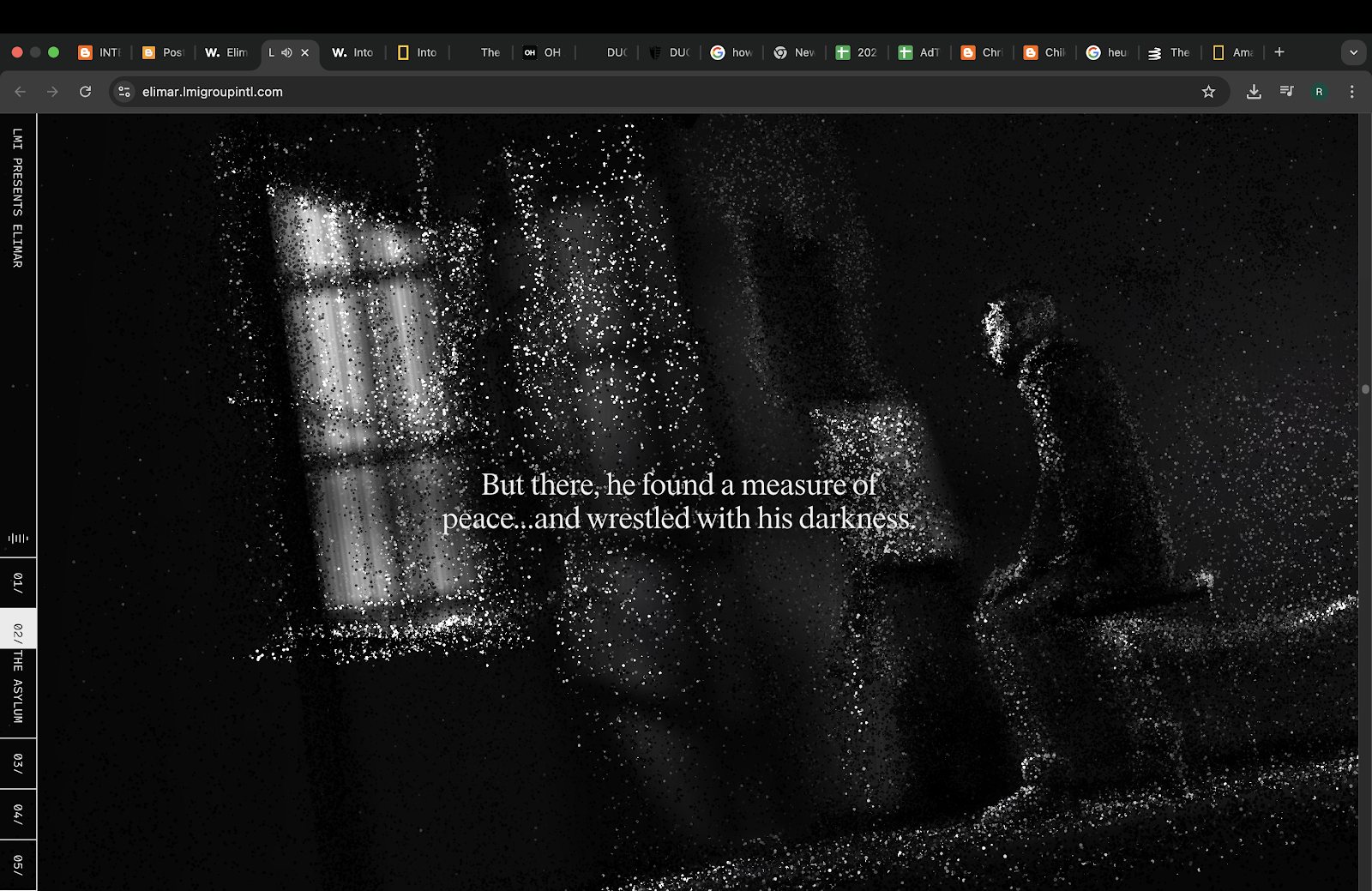 |
| Fig 2.7. Color, Typography & Imagery (Week 2 - 29/2/25) |
Visual : The colors used are mostly monochromatic black and white, on the text and most of the website, with the colors only coming from photos that gives off a feeling that it was old (brown stained photos) and the colorful paintings of Vincent van Gogh that created emphasis of what they are talking about. If I were to think into the meaning of the use of color, I would probably define the monochromatic black and white to symbolizes the mental state of Vincent and the colorful painting as his only solace in the world, giving color to his miserable and monochromatic world. The typography mainly uses serifs which gives off the old story kind of feeling while still looking classy, which is suitable as if I think of Vincent van Gogh, I would think classical and old in a long time ago kind of meaning. The images used are quite unique as it isn't really an image but a group of broken shards of shapes that when you scroll down will almost combine to make a somewhat visible picture that is related to what the text is talking about. Though the pictures that are like inserted in, is quite clear, and you can still see what the picture contains.
- Consider the functionality and usability of the website, including its navigation, forms, and interactive elements.
 |
| Fig 2.8. Navigation, Forms & Interactive Elements (Week 2 - 29/2/25) |
 | |
|
Usability : It's very fun to explore but not too confusing because it's not as complicated as the first website. The navigation uses scrolling however unlike the first website, it actually slows down once you get to the part but go faster on an empty space. If you need to go to certain parts, you can click on a little side bar on the bottom left to bring you to certain part of the story, which is unusual as the location is usually on the top part of the screen on a desktop but you know it's clickable because there are feedback when you hover your cursor on top of it, making the option below the cursor to expand and become grey. Other feedbacks that you can see is on the front page where the title is, if you move your cursor the black hole in the background will move slightly following your cursor. There are no forms, as once again it is an informative website not a subscription type of website. There are some unique interactive elements, specifically on the parts where you can actually navigate the painting and there are these dots that you can click and a little fun fact will pop up. There is also an option for you to turn on the set music if you want the full on experience in the website, it was quite a nice touch but the music surprised me a little due to it's high intensity, I think it's classical music so it's quite suitable for the theme of the website.
- Evaluate the quality and relevance of the website's content, including its accuracy, clarity, and organization.
 |
| Fig 2.10. Accuracy, Clarity, Organization (Week 2 - 29/2/25) |
Contents : Based on what they said, the information contained in the website is a result of research conducted by a team for four whole year. There is no sources linked other than that so it's unknown if the information is correct or not, there are their report which they link after the conclusion that contained their research and in the website they did input in a short clip of them doing some kind of testing, so it is possible that the information inside is credible. Other than that though, the contents were organized quite well, with the story starting from the artist, to his background, his painting, then the certain painting being analyzed in the website. The content can be read clearly, with a nice selection of typography and colors and the correct use of grammar as well.
- Consider the website's performance, including its load times, responsiveness, and compatibility with different devices and browsers.
 |
| Fig 2.11. Load times, Responsiveness & Compatibility (Week 2 - 29/2/25) |
Performance : The load time and response is fast, there are no lag and I tried opening it on Safari, Firefox and Chrome as well as on my phone, The same fast load time and response, hence the compatibility with other devices and browsers are high. The difference is just that, on the phone, most of the image animation disappear, I'm guessing to minimize lag on the mobile phone.
- Consider the purpose and goals of the website, and evaluate whether they are effectively communicated to the user.
 |
| Fig 2.12. Clear purpose communication (Week 2 - 29/2/25) |
- Evaluate the visual design and layout of the website, including its use of color, typography, and imagery.
 |
| Fig 2.13. Color, Typography & Imagery (Week 2 - 29/2/25) |
Visual : This website is super simple in terms of design, The typography filled most of the entire first home page itself, using serifs letter with italic on everything other than the connecter word "to". Other than the title, everything else uses sans-serif fonts. The colors used are monochromatic black and white. the colors that you can see is only via the video and pictures on the website. About imagery, the first thing that you're going to see when you first open the website is a video but then it switched place with the second page which is the title page but you can still see the video running on the second page. Then the rest of the image is contained in the content of the website, where you can see different type and style of picture and videos submitted, there's not really a theme except the same given theme of "cities".
- Consider the functionality and usability of the website, including its navigation, forms, and interactive elements.
 | |
|
Usability : It's easy to use though a little confusing at first due to the words suddenly moving, but then i discover that it was part of the feedback, if you hover on top of it it'll move. However the title can not be clicked even if it moved and only the menu on the top right is clickable, and it'll expand into the whole screen where you can then choose which one you want to check out. The navigation of the home page is easy enough, you just need to scroll down a bit until you reach the main content. The content can be count as interactive elements as if you hover on to a certain image, it will be more vibrant and if it's a video it will show a short preview, you can drag the screen to left and right just by hovering left and right on the main content. There was no form though as it is somewhat like an museum filled with photos from people all around the world.
- Evaluate the quality and relevance of the website's content, including its accuracy, clarity, and organization.
 |
| Fig 2.15. Accuracy, Clarity, Organization (Week 2 - 29/2/25) |
Contents : The website contents has it's credit page where you can access through the menu and scroll down until you find one line that is underlined, the underline symbolizing that it's clickable, so the content should have a good information accuracy. The text that can be read is quite clear and readable, so it also has high clarity. The organization is not really clear as it only has 3 page in the home page, but it doesn't look messy so I'll count it as a win on the organization part of the quality of the website's content.
- Consider the website's performance, including its load times, responsiveness, and compatibility with different devices and browsers.
 |
| Fig 2.16. Load times, Responsiveness & Compatibility (Week 2 - 29/2/25) |
Performance : So far, the load time and responsiveness is quite fast with no lag at all. It is also compatible with the browsers and devices that I tested on. On the phone screen though, you can not see all the main content and you need to drag left and right yourself to check out the rest of the image/videos available there.
- Consider the purpose and goals of the website, and evaluate whether they are effectively communicated to the user.
 |
| Fig 2.17. Clear purpose communication (Week 2 - 29/2/25) |
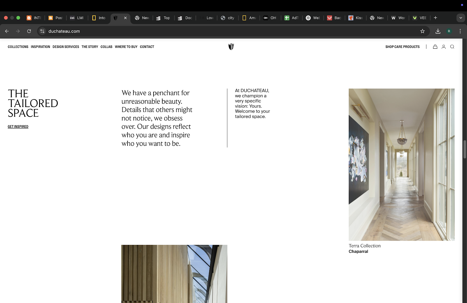
Purpose and goals : At first glance, I immediately thought of architecture and interior designs was it's main topic due to the first image that is put in the very front of the website. As I scroll down I did realized that it was indeed connected to interior designs, specifically selling items such as floorings and appliances. The image chosen did make it clear on what it was but without further description I was in doubt whether or not my thought was correct. It was cleared up once I open up what service they were selling by clicking on the menu on the top. So while it was communicated quite clearly as I can guess what it was at first glance, without further description on the front page to validate my thoughts, it became vague on what the website it communicating about. So it's not as effectively communicated but it's still an okay website regarding the communicating the purpose and goals.
- Evaluate the visual design and layout of the website, including its use of color, typography, and imagery.
 |
| Fig 2.18. Color, Typography & Imagery (Week 2 - 29/2/25) |
Visual : If I were to describe it, It's a very clean and professional look suitable as it looks like they are selling high end materials and services.They use mostly neutral color like black, white and beige for most of their website which usually gives off a sense of simplicity while bringing an expensive kind of vibe on to the website, this of course needed to be supported by the correct image that gives off the same vibe. So their images of interior designed rooms uses dark and light colors with a little pop of color to give the room some life while still giving that cozy yet fancy feeling in the room. As for the typography, They use serif for text with higher hierarchy and sans-serif for text with lower hierarchy. The serifs gives off expensive vibe as you can't really use cursive on a website unless it will look cheap so serifs are a nice alternatives to it but if you uses it on a small text it will look weird hence the use of sans-serifs on the smaller texts.
- Consider the functionality and usability of the website, including its navigation, forms, and interactive elements.
 | |
|
Usability : It's easy to navigate however they don't really tell you what you need to do to navigate through the website but it most cases it's scrolling which is what this website uses. You can just scroll down to look at the catalogue option and there are also a choice button, which is basically the interactive element on this website, on the bottom left that you can select to bring you to where you want, during selecting it will give you feedback, on the part that you are in currently there will be a half circle beside the option while the other option will become white if you hover on top of it. There is also an option to see all products that you can click where if you hover on top of it, the line beneath the text will move slightly to indicate that it is clickable. The navigation there is mostly similar to the rest of the website, you just need to scroll to see the rest of the website. Other interactive elements that is the most obvious is of course the menu choices that showcases most of their services and other information regarding the company and the logo is also clickable, bringing you back to the home screen. There is a profile picture on the menu on the top right which you can click and it will show you a form for you to login, and on the bottom there will be a form for you to fill in your email address as well.
- Evaluate the quality and relevance of the website's content, including its accuracy, clarity, and organization.
 |
| Fig 2.20. Accuracy, Clarity, Organization (Week 2 - 29/2/25) |
Contents : The information accuracy should be accurate and credible because this is a company website, it is filled with their information with no room for inaccurate information as it could damage or disturb their business. The clarity of the content is clear, you can read the text with no problem and understand the text due to the use of simple and common words as well as the right grammar. The organization is neat, as it should be as this is a company website so it needs to look and be tidy so that the user could navigate smoothly and is more tempted to buy their services because no one is going to buy a service if they are already chased away due to chaotic looking website that may or may not look like a scam instead of an actual business.
- Consider the website's performance, including its load times, responsiveness, and compatibility with different devices and browsers.
 |
| Fig 2.21. Load times, Responsiveness & Compatibility (Week 2 - 29/2/25) |
Performance : The same as the rest of the website I've analyzed so far, the load and response is fast without any lag or minimal lag that only last half a second if there is a problem with connection. The compatibility with other browsers and devices is also high so the performance of this website is good. On the mobile phone though, the image is cut off which is a normal occurrence but the text placement is different to make it readable, and the menu is kept into the three line on the top left corner of the screen.
- Consider the purpose and goals of the website, and evaluate whether they are effectively communicated to the user.
 |
| Fig 2.22. Clear purpose communication (Week 2 - 29/2/25) |
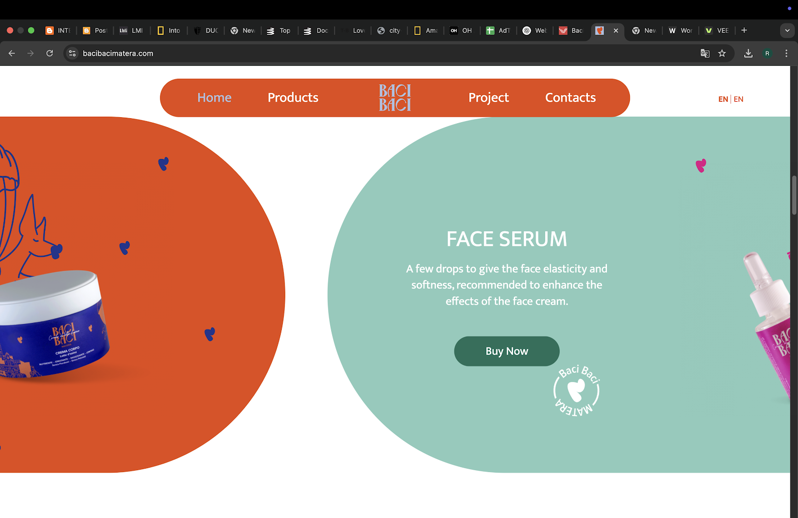
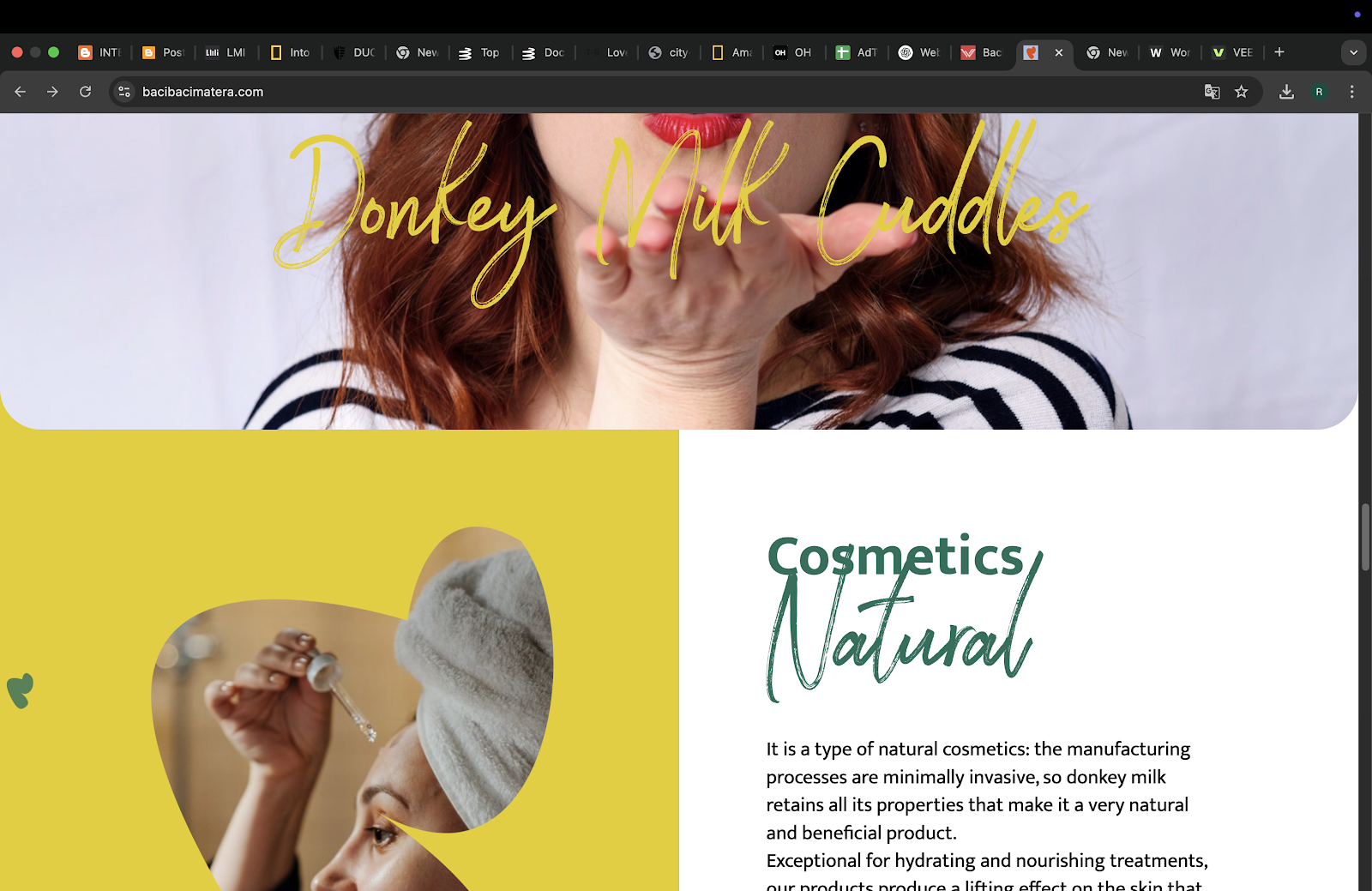
Purpose and goals : To sell their donkey milk based skincare product, very clear communication as the front page immediately showcase the product to you, with a donkey as the main graphic picture in the middle.
- Evaluate the visual design and layout of the website, including its use of color, typography, and imagery.
 |
| Fig 2.23. Color, Typography & Imagery (Week 2 - 29/2/25) |
 |
| Fig 2.24. Color, Typography & Imagery (Week 2 - 29/2/25) |
Visual : Very colorful but not to vibrant, it has lot of rounded edges making it look cute which is good because the main subject to sell the product to is females, and usually the cuter something is the more they want to buy it. The typography is different than what I've seen from the rest of the website before as this one uses sans-serifs and cursive, which is normally a taboo to use in a website as it makes it looks cheap. However due to the minimal use of it, with the uses being to emphasize certain words, it is still readable. The bonus of the cursive, it makes the website looks somewhat more cuter in a way and not too dull as they only uses one type of sans-serif by the looks of it. The image used is very cute and colorful, the same as the rest of the website so it does creates a kind of harmony in the website.
- Consider the functionality and usability of the website, including its navigation, forms, and interactive elements.
 |
| Fig 2.25. Navigation, Forms & Interactive Elements (Week 2 - 29/2/25) |
 |
| Fig 2.26. Navigation, Forms & Interactive Elements (Week 2 - 29/2/25) |
Usability : It's easy to navigate as you just need to scroll and there are also a menu on the top which helps for easy navigation. The feedback given when you hover on top of one of the choices is that it will become grey instead of white, the same color as the text of the current page/menu. There are some forms, one of them being a form of subscription and a form to write them a message. There is not really any interactive elements other than the call to action button and the menu on the top.
- Evaluate the quality and relevance of the website's content, including its accuracy, clarity, and organization.
 |
| Fig 2.27. Accuracy, Clarity, Organization (Week 2 - 29/2/25) |
Contents : The accuracy of the content in the website should be accurate because of the same reason as website 4, it's a company website, the information needs to be correct with no room for error. The texts are readable and the grammar is correct, making the content clarity quite high. The organization of the content is quite nice, as you can actually differentiate which page is which but it still looks connected even if there's a difference in colors.
- Consider the website's performance, including its load times, responsiveness, and compatibility with different devices and browsers.
 |
| Fig 2.28. Load times, Responsiveness & Compatibility (Week 2 - 29/2/25) |
Performance : The website load and respond fast, it's also compatible with all the browser and devices that I've tried it on. The only difference is as usual on the phone, where instead of showcasing all the product in the main front page, they showcase it one by one, changing it every few seconds.
Brief Analysis (Summarized Vers.) :
 |
| Fig 2.29. Summarized Pictures 1 (Week 2 - 29/2/25) |
Fig 2.30. Video of Navigation, Forms & Interactive Elements (Week 2 - 29/2/25)
As the title mention, The website purpose is to document the journey of exploring the amazon, hence "Into The Amazon". In terms of communication, I think this website is making it quite clear on what it's talking about as the text and image continue to correlate to one another to boost the communication of the story even further. For example if it's talking about water that starts on top of the mountain, they will show an image of a mountain to support the text. The photos/images used are fully showcasing the beauty of nature. It showcases the location clearly and the colors used are suitable for the topic "the amazon" ,using a neutral earthy color and a cool blue color, depending on the location it's currently explaining. The fonts used are mostly serifs with some sans-serif text as a heading to separate the content.
It's navigation is quite interesting, as I have mentioned earlier it's like you're watching a story telling video just by navigating throughout the website. By using the cursor to scroll in order to read the next part of the content, however it's not in a singular line as it follows the way the landscape can be walked through so it's as if we're there walking alongside the researcher. Although it's sometimes a bit confusing as nothing can help control the speed of the scrolling, making it so that the user can unknowingly skip a part of the content. There's not really any forms as it's just an informative website and the interactive elements is mostly located on the scrolling navigations but there are also things like the map which you can click to see icons that represent the location and main point of each part of the journey along with a choices side bar that contains slight description about each icons ,which you can click and see the article explaining more on specifically that part of the story.
The information inside the website is mostly directly quoted from the national geographic website that pop out when you type in 'amazon expedition national geographic', so it is quite safe to say that the information inside is accurate. The storytelling is also quite clear as it is telling the story starting from where the journey started and continuing on depending on where they are going, the texts is readable because the fonts and colors chosen are suitable. The organization of the website is a bit too complicated to think about, but because of how the navigation works, it looks complicated but still somehow looks organized as the navigation leads our eyes on where the text starts so the reading flow are smooth. The load and response time is fast even if it's in a different browser. However, on a mobile phone, there is a certain part of the animation that will be lagging due to high amount of things going on there. But other than that, the compatibility of the website is quite high.
(497 words)
 |
| Fig 2.31. Summarized Pictures 2 (Week 2 - 29/2/25) |
With the story telling starting from the start of Vincent van Gogh to the part where he created the painting mentioned, it then goes on to the details on the painting and describing each detail that can be navigated. The purpose of the website is definitely communicated clearly. The colors used are mostly monochromatic black and white, on the text and most of the website, with the colors only coming from photos that gives off a feeling that it was old (brown stained photos) and the colorful paintings of Vincent van Gogh that created emphasis of what they are talking about. The typography mainly uses serifs which gives off the old story kind of feeling while still looking classy. The images used are quite unique as it isn't really an image but a group of broken shards of shapes that when you scroll down will almost combine to make a somewhat visible picture that is related to what the text is talking about. Though the pictures that are like inserted in, is quite clear, and you can still see what the picture contains.
The navigation uses scrolling however unlike the first website, it actually slows down once you get to the part but go faster on an empty space. If you need to go to certain parts, you can click on a little side bar on the bottom left to bring you to certain part of the story. There are no forms, as once again it is an informative website not a subscription type of website. There are some unique interactive elements, specifically on the parts where you can actually navigate the painting and there are these dots that you can click and a little fun fact will pop up. There is also an option for you to turn on the set music if you want the full on experience in the website.
There are their report ,which they link after the conclusion that contained their research and in the website they did input in a short clip of them doing some kind of testing, so it is possible that the information inside is credible and accurate. Other than that though, the contents were organized quite well, with the story starting from the artist, to his background, his painting, then the certain painting being analyzed in the website. The content can be read clearly, with a nice selection of typography and colors and the correct use of grammar as well. The load time and response is fast, there are no lag and I tried opening it on Safari, Firefox and Chrome as well as on my phone, The same fast load time and response, hence the compatibility with other devices and browsers are high. The difference is just that, on the phone, most of the image animation disappear, I'm guessing to minimize lag on the mobile phone.
(477 words)
 |
| Fig 2.32. Summarized Pictures 3 (Week 2 - 29/2/25) |
In short, it's basically a museum where people can participate and input in their own pictures of ways of living in the city through the documentation of art, architecture and everything else in their city that can be documented. I don't really get it to be honest, but I'm guessing they want to see how the city looks in other people's eyes when they are working or something. But still, I don't think the communication of this website is that clear and effective because the explanation is quite short and I can only understand what the website want to do slightly, and that was also helped by the already existing documentations.
This website is super simple in terms of design, The typography filled most of the entire first home page itself, using serifs letter with italic on everything other than the connecter word "to". Other than the title, everything else uses sans-serif fonts. The colors used are monochromatic black and white. the colors that you can see is only via the video and pictures on the website. About imagery, you can see different type and style of picture and videos, but there's not really a theme except the same given theme of "cities". The navigation of the home page is easy enough, you just need to scroll down a bit until you reach the main content. The content can be count as interactive elements as if you hover on to a certain image, it will be more vibrant and if it's a video it will show a short preview, you can drag the screen to left and right just by hovering left and right on the main content. There was no form though as it is somewhat like an museum filled with photos from people all around the world.
The website contents has it's credit page so the content should have a good information accuracy. The text that can be read is quite clear and readable, so it also has high clarity. The organization is not really clear as it only has 3 page in the home page, but it doesn't look messy so I'll count it as a win on the organization part of the quality of the website's content. So far, the load time and responsiveness is quite fast with no lag at all. It is also compatible with the browsers and devices that I tested on. On the phone screen though, you can not see all the main content and you need to drag left and right yourself to check out the rest of the image/videos available there.
(432 words)
 |
| Fig 2.33. Summarized Pictures 4 (Week 2 - 29/2/25) |
At first glance, I immediately thought of architecture and interior designs and as I scroll down I did realized that it was indeed connected to interior designs and while the image chosen did make it clear on what it was but without further description I was in doubt whether or not my thought was correct. So it's not as effectively communicated but it's still an okay website regarding the communicating the purpose and goals. They use mostly neutral color like black, white and beige for most of their website which usually gives off a sense of simplicity yet still looks expensive. The images used were that of interior designed rooms that uses dark and light colors with a little pop of color to give the room some life while still giving that cozy yet fancy feeling in the room. As for the typography, They use serif for text with higher hierarchy and sans-serif for text with lower hierarchy.
It's easy to navigate however they don't really tell you what you need to do to navigate through the website but in most cases it's scrolling which is what this website uses. You can just scroll down to look at the catalogue option and there are also a choice button, which is basically the interactive element on this website. Other interactive elements that is the most obvious is of course the menu choices that showcases most of their services and other information regarding the company and the logo is also clickable, bringing you back to the home screen. There is a profile picture on the menu on the top right which you can click and it will show you a form for you to login, and on the bottom there will be a form for you to fill in your email address as well.
The information accuracy should be accurate and credible because this is a company website, it is filled with their information with no room for inaccurate information. The clarity of the content is clear, you can read the text with no problem and understand the text due to the use of simple and common words as well as the right grammar. The organization is neat, as it should be as this is a company website so it needs to look and be tidy so that the user could navigate smoothly and is more tempted to buy their services
The same as the rest of the website I've analyzed so far, the load and response is fast without any lag or minimal lag that only last half a second if there is a problem with connection. The compatibility with other browsers and devices is also high so the performance of this website is good. On the mobile phone though, the image is cut off which is a normal occurrence but the text placement is different to make it readable, and the menu is kept into the three line on the top left corner of the screen.
(496 words)
 |
| Fig 2.34. Summarized Pictures 5 (Week 2 - 29/2/25) |
This website very clear communication as the front page immediately showcase the product to you, with a donkey as the main graphic picture in the middle. The use of color in this website is quite a lot, it's very colorful but not to vibrant, it gives off a cute look on the website.The typography is different than what I've seen from the rest of the website before as this one uses sans-serifs and a little bit of cursive to emphasize a certain word.The image used is very cute and colorful, the same as the rest of the website so it does creates a kind of harmony in the website.
It's easy to navigate as you just need to scroll and there are also a menu on the top which helps for easy navigation.There are some forms, one of them being a form of subscription and a form to write them a message. There is not really any interactive elements other than the call to action button and the menu on the top. The accuracy of the content in the website should be accurate because it's a company website, the information needs to be correct with no room for error. The texts are readable and the grammar is correct, making the content clarity quite high. The organization of the content is quite nice, as you can actually differentiate which page is which but it still looks connected even if there's a difference in colors.
The website load and respond fast, it's also compatible with all the browser and devices that I've tried it on. The only difference is as usual on the phone, where instead of showcasing all the product in the main front page, they showcase it one by one, changing it every few seconds.
(295 words)
Reflection
I'll be honest, I was not really looking forward to do this task and procrastinated to do it until the deadline. It was fascinating to look at such interactive and pretty website with such great designs but in order to do this exercise, I had to try to be critical and evaluating the website both objectively and subjectively. It was Extremely tiring to try to communicate how I thought and felt about certain things on a website and I was mostly confused on which part that I can say is bad and good, though it did give me some insights on what other kind of websites could look like, I never knew website could be so uniquely different from others with such fun designs.
Comments
Post a Comment