21/04/25 - 21/05/25 ( Week 1 - Week 5 )
Carren Yeliandi / 0376990
Advanced Typography / Bachelors of Design in Creative Media / Taylor's University
Task 1 - Exercises
Carren Yeliandi / 0376990
Advanced Typography / Bachelors of Design in Creative Media / Taylor's University
Task 1 - Exercises
TABLE OF CONTENTS
Lectures
LECTURE 1
Typographic Systems
- All designs are based on a structural system.
- The 8 major systems are :
- Axial : Left & Right of a single axis
- Radial : Spread out from a single point of focus
- Dilational : Following the shape of a single point of focus in a circular shape.
- Random : No specific pattern
- Grid : divided vertically and horizontally
- Transitional : Layered banding
- Modular : Standardized units
- Bilateral : Symmetrical in a single axis

|
| Fig 1.1. 8 Major Typographic system (Week 1 ; 27/4/25) |
Note :
From the top left to the top right : Axial, Radial, Dilational, Random
From the bottom left to the bottom right : Grid, Modular, Transitional,
Bilateral
- Typographic system is similar to what architects call 'shape grammars' (a set of shape rules that apply in a step-by-step way to generate a set, or language, of designs).
LECTURE 2
Principles of Design Composition : Typographic Composition
-> Composition : Dominant principles underpinning design composition (Emphasis, repetition ;etc)
-> More suitable for imagery, more ambiguous for complex typographic layout.
Typographic Systems
-> The most used / popular : The grid system
-> Other models :
- Environmental Grid = An exploration of existing structures and numerous structures, an extraction of crucial lines (straight and curved), information will follow the shapes created.
- Form and Movement = an exploration of existing grid systems, a model created to induce explorations of grid systems, to see the turning of pages into a slowed-down animations. The level of complexity increases with each new elements introduced (Ex. Emphasis colors
LECTURE 3
1. Handwriting
-> the first mechanically produced typography is meant to mimic handwriting.
-> Handwritings are influenced by the tools and materials used.
2. The Phoenician alphabet revolutionized written language by representing sounds instead pictorial representations.
3. Egyptian hieroglyphs utilized complex system of rebus and phonetic characters to convey both sound and meaning.
4. The Korean Hangul was the world's first phonetic alphabet designed for ease of learning and writing
5. The Brahmi Script, an Indian Script, is one of the most influential writing systems. Most likely influenced by contemporary Semitic Script.
6. The Pallava Script, a Javanese Script, has significant influence towards southeast Asian writing systems
7. The Carolingian Miniscule is the standard for humanistic writing in the 15th century and the basis of lowercase Roman type
8. The Indus Valley Civilization remains undeciphered but is believed to be logo-symbolic and possibly non-linguistic
9. The Kawi Script was used during ancient Malay Peninsula Kingdoms.
LECTURE 4
- Designers must recognize the social impacts and necessity of typefaces as it is the moral obligation of designers to improve legibility and offer artistic expressions.
- Typeface designing process involves understanding, legibility, readability, type history, and its function in different uses.
- Successful type design required deep investment in the conceptual and practical aspect of creation. It requires time and detail orientation so designers must navigate complexities of aesthetics, functionality and the communication needs of their stakeholders.
Instructions
<iframe
src="https://drive.google.com/file/d/1QDey9mxlxLksXQliAjWr7NJb_BqfRIWe/preview"
width="640" height="480" allow="autoplay"></iframe>
EXERCISE 1 : TYPOGRAPHIC SYSTEM
"Arrange the given content into the 8 typographic system explained in the first lectures"
Before starting anything, I first learned what are typographic systems from
the lectures given before continuing on Indesign.
Below are the contents that I will use (Number of importance) :
"The Design School,
Taylor’s University (4)
All Ripped Up: Punk Influences on Design (1)
Open Public Lectures: (2)
June 24, 2021
Lew Pik Svonn, 9AM-10AM
Ezrena Mohd., 10AM-11AM
Suzy Sulaiman, 11AM-12PM (3)
June 25, 2021
Lim Whay Yin, 9AM-10AM
Fahmi Reza, 10AM-11AM
Manish Acharia, 11AM-12PM (3)
Lecture Theatre 12 (2)"
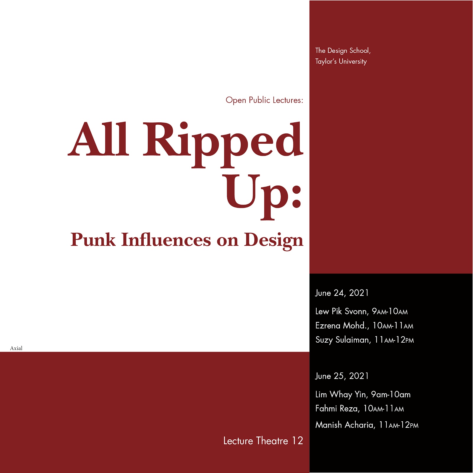
A. Axial
I wanted to make it interesting by using angles, I divided
the two sides into different colors to insinuate the axis. I mainly used
two typefaces, ITC Baskerville Std for the title and Futura Std for the rest
of the text. But to establish hierarchy, I used different font of Futura Std
and different text size to further show the difference.
 |
| Fig 1.1. Axial System (Week 2 ; 29/4/25) |
B. Radial
For this, I created a circle to be the middle point of the circle and
then just spread out the texts using that middle point.
 |
| Fig 1.2. Radial System (Week 2 ; 29/4/25) |
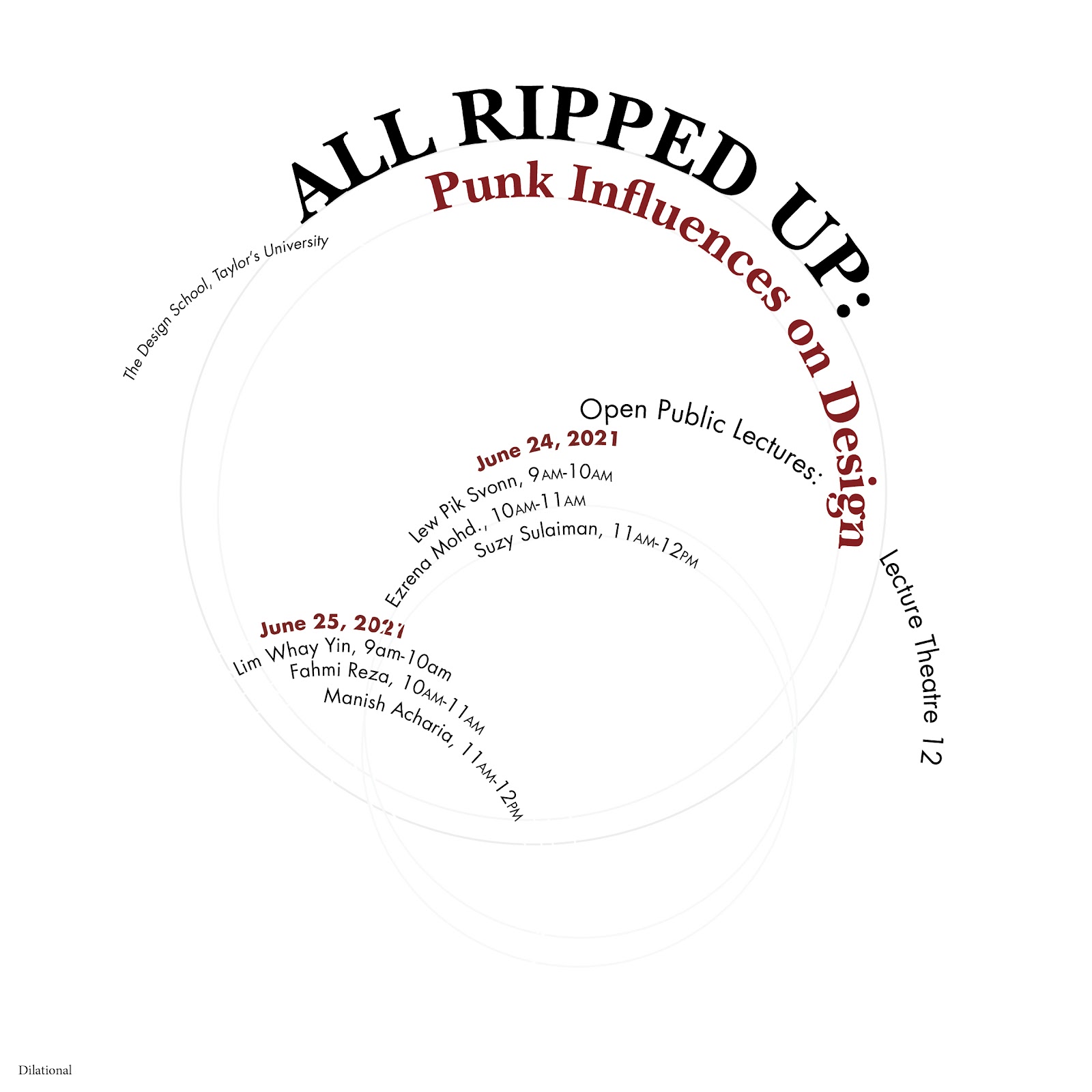
C. Dilational
For this one, I used a circle tool and
hold shift to form a perfect circle which then I would use the shape
text type to make the text to make the round angle. I didn't really
understand how to sort the information so I just did a simple one to get
some feedback.
 |
| Fig 1.3. Dilational System (Week 2 ; 29/4/25) |
D. Random
I don't really understand the
meaning of random for this particular task. So I just thought it to
be making it however I want. So I just made the title to have many
shadows by duplicating it and changing the color to a lighter shade
and then lowering the opacity the more it went down. Then I just
copy paste every text and made it to a 2-5% opacity and just scatter
it around. Then I just arrange the rest of the text around the whole
layout.
 |
| Fig 1.4. Random System (Week 2 ; 29/4/25) |
E. Grid
I just used the grid that I already had which is the 3 x 4 grid
and just positioned each texts based on the guide lines.
 |
| Fig 1.5. Grid System (Week 2 ; 29/4/25) |
F. Modular
I followed the tutorial given by mr.Vinod and made a 5 x 4
guide grid to act as my modular spacing. Then I just adjust
each text into the sections with the title taking the biggest
part. I added graphics as I felt like it was too empty.
 |
| Fig 1.6. Modular System (Week 2 ; 29/4/25) |
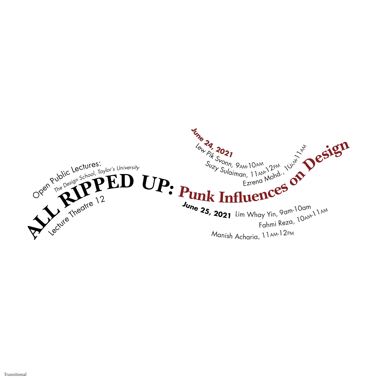
G. Transitional
I thought that transitional meant to be flowy, so I
made it that way by using the pen tool to make wavy
lines then using type on path tool to make the text
follow the wavy lines. I made the title as the anchor
for the other texts to stick on to.
 |
| Fig 1.7. Transitional System (Week 5 ; 21/5/25) |
H. Bilateral
This one is quite simple, as I just need to make it
symmetrical. I made it to be straight up symmetrical
from the middle then just adjust the text on the
left and right to be aligned with each other.
 |
| Fig 1.8. Bilateral System (Week 5 ; 21/5/25) |
I then submitted the compositions for
feedback.
 |
| Fig 1.9. Compiled 8 System (Week 2 ; 30/4/25) |
All in all, the feedback mostly mentioned my overuse
of graphic. So, I'm going to try to not use any if
possible or as minimal as possible.
Specific feedback of each designs =
- axial : too much graphic
- radial : too much graphic, and maybe if it doesn't work without the graphic, it just doesn't work
- grid : it's fine
- transitional : it's okay, but you can spread out the information more and it looks a little bit hanging
- bilateral : it's fine
- modular : too much graphic
- dilational : it needs more information management, it's badly managed
- random : it's not random, it needs to be more chaotic.
I. REVISIONS
- Axial
To fix this one was simple, I just need to lessen the
graphic by making it into a line instead of separating
it by blocks.

|
| Fig 1.10. Axial System Exploration (Week 5 ; 21/5/25) |
- Radial
I erased all the graphics and used solely the texts to create the layout. I used a line tool + hold shift to create the diameter line as a base to line up my texts.
 |
| Fig 1.11. Radial System Exploration (Week 5 ; 21/5/25) |
- Dilational
I added more texts to fill in the empty space more.
 |
| Fig 1.12. Dilational System Exploration (Week 5 ; 21/5/25) |
- Random
I did a scrapbook type of layout but trying to minimize the amount of graphic that I used. In the end, I scatter around a few texts around and layered them in low opacity to try to fill in the rest of the empty space without it being too overwhelming. For this one, I used mostly all the 10 fonts given just too add more variation.
 |
| Fig 1.13. Random System Exploration (Week 5 ; 21/5/25) |
- Grid
There is actually no problem here, but I'm trying out different layout with a different font (Sans-serif font = Futura Std Extra Bold). However, I stuck with the original one in the end.
 |
| Fig 1.14. Grid System Exploration (Week 5 ; 21/5/25) |
- Modular
Again, minimizing the graphics used. To compensate the loss of graphic, I sized up the text to try to fill in the empty space.
 |
| Fig 1.15. Modular System Exploration(Week 5 ; 21/5/25) |
- Transitional
I made the title bigger and scatter the text around more.
| Fig 1.16. Transitional System Exploration (Week 5 ; 21/5/25) |
- Bilateral
There was also no problem here, but I tried again using the same way as I tried grid which is by changing the main title into a sans-serif font. The I just tried to arrange it some more and then choose the one I like best as my final submission. (I also did realized too late that the one that I submitted for feedback was not in center alignment)
 |
| Fig 1.17. Bilateral System Exploration (Week 5 ; 21/5/25) |
EXERCISE 1 FINAL SUBMISSION COMPILATION
 |
| Fig 1.18. Final Axial System (Week 5 ; 21/5/25) |
 |
| Fig 1.19. Final Radial System (Week 5 ; 21/5/25) |
 |
| Fig 1.20. Final Grid System (Week 5 ; 21/5/25) |
 |
| Fig 1.21. Final Transitional System (Week 5 ; 21/5/25) |
 |
| Fig 1.22. Final Bilateral System (Week 5 ; 21/5/25) |
 |
| Fig 1.23. Final Modular System (Week 5 ; 21/5/25) |
 |
| Fig 1.24. Final Dilational System (Week 5 ; 21/5/25) |
 |
| Fig 1.25. Final Random System (Week 5 ; 21/5/25) |
<iframe
src="https://drive.google.com/file/d/1VGhRZ-QGuveiJNcCTOAH5lA9AZIb-pQQ/preview"
width="640" height="480" allow="autoplay"></iframe>
<iframe src="https://drive.google.com/file/d/10lLSgxQp6anv2EAyNRDUxGM7vfzpFHqI/preview" width="640" height="480" allow="autoplay"></iframe>
Observation :
I thought the font was limiting but from what I have seen, my classmates managed to used all the fonts potential unlike me who limited myself to only using two to three fonts which is a result of not enough exploration. I also observed that even though some people used the same reference, the result differs per person due to how one analyzed and develop it.
Findings :
I should try to explore more options and not limit myself to certain mindset. I find that I can explore much more easier if I don't try too hard to think out of the box and just try what I think would look good and maybe use more variation of style and font rather than sticking to two or three. I also find that I tend to search for an easy way out rather than actually trying to solve it, though this is also due to the fact to the solution I find is usually the most obvious thing in the world.
It's a book containing the evolvement of alphabet throughout the centuries. Starting from the origins of writing which were in the form of clay tokens in c. 3150 BCE until the typography in the twentieth century. Along with pictures of the alphabet and typography, there is also historical background stories accompanying the explanation of the pictures.
This particular part introduces us to basics what and why on the origin of type and language. From the meanings of type to a glimpse of how and why alphabet evolved over time. It also tells us the habit of certain times and how it effects the alphabet they develop.
EXERCISE 2 : TYPE
& PLAY
I was in the toilet when I was thinking what type of image do I want to
extract a font from when I saw a glass beside me and decided to extract one
from a glass.
So I went to search for a stock image of a glass and decided to use an image
of a shattered glass.
 |
| Fig 2.1. Shattered Laminated Glass Stock (Week 3 ; 6/5/25) |
I uploaded that image onto illustrator with an A4 artboard that was placed
horizontally and started to select some part of the shattered glass shards to
trace into a similar letter. I used the pen tool for this.
 | |
|
I then selected Futura Std Medium Condensed as my base font.
I then first develop the two of them separately before combining them by
using selected point tool and selected tool. I made the sans-serif base font
into a font with sharper angles to insinuate the glass and the extracted
base font I made into a more consistent size.
 |
| Fig 2.3. Overlapping extracted font and base reference font (Week 3 ; 8/5/25) |
 |
| Fig 2.4. Overall shape of the base reference font with sharp angles (Week 3 ; 8/5/25) |
 |
| Fig 2.5. Adjusted size of extracted font (Week 3 ; 8/5/25) |
I then made 2 different font, one of them
leaning onto the more readable sans-serif base font and the other leaning
more on the artistic side of the extracted font. For this I used the pen
tool to add and lessen the points that can be adjusted in the letters and
move them around using the selection tool.
I made the more readable one by taking the adjusted and sharpened Futura Std
font and gave them some sharp bits peeking out of some places and made some
lines just like the extracted font.
 |
| Fig 2.6. Refining Process 1 (Week 3 ; 8/5/25) |
 |
| Fig 2.7. Refining Process 2 (Week 3 ; 8/5/25) |
For the one leaning to the artistic side, I simply adjusted the readable one
and made it thinner then added some parts from the extracted font to show more
on the font.
 |
| Fig 2.8. Refining Process 3 (Week 3 ; 8/5/25) |
I then compiled them into one page and submitted it for feedback.
 |
| Fig 2.9. Compiled refining + chosen font (Week 3 ; 8/5/25) |
After feedback, I was trying out the recommended way by my lecturer.

|
| Fig 2.10. Revision 1 (Week 3 ; 9/5/25) |
I then added more angles but decided that it looked a bit weird.

|
| Fig 2.11. Continuation of revision 1 (Week 3 ; 9/5/25) |
So I decided to try a new way by making a point of impact to be shown.
 |
| Fig 2.12. Glass breaking pattern (Week 3 ; 6/5/25) |
I did that a few times before I realized that
it didn't look like the extracted font at all, it seems as the letter is the
glass as a whole with broken shards inside rather than it being the shards
itself, which I extracted from the image chosen.
 |
| Fig 2.13. Exploration 1 (Week 4 ; 12/5/25) |
 |
| Fig 2.14. Exploration 2 (Week 4 ; 12/5/25) |
 |
| Fig 2.15. Exploration 3 (Week 4 ; 12/5/25) |
I then continued with what the lecturer
instructed instead. which is by giving the letters straight cut lines by using
line tool then adjust the size of the stroke -> Object -> Path ->
Outline strokes. I then made the letter into a compound path (Object ->
Compound Path -> Make) before using pathfinder (Windows -> Pathfinder)
-> Minus front (Making sure the lines stroke is in the front).
After that is done, I realized that the stroke
is a little inconsistent so I made the A into a the base thickness by dragging
the guide mark on to the size of the letter 'A' and the adjusted the other
letter based on the guide by using pen tool and selected tool.
 |
| Fig 2.16. Final revision (Week 4 ; 12/5/25) |
 |
| Fig 2.17. Close up of finished revision (Week 4 ; 12/5/25) |
After everything is finished I moved on to the
poster. I found a base poster online to give me a clue on what is needed for a
movie poster.

|
| Fig 2.18. Movie Poster Texts References (Week 4 ; 13/5/25) |
I searched for a picture to use on pinterest and google and added that as my
background image.
 |
| Fig 2.19. Shattered glass with a person silhouette (Week 4 ; 13/5/25) |
I then added my chosen title in the color red and a layer of gradient on the
top to give a more creepy feel.
 |
| Fig 2.20. Movie Poster process 1 (Week 4 ; 13/5/25) |
I selected "Univers Std" as the base font for
the texts and begin typing all the necessary names. I also added more knick
knacks on the poster with effects like shadow drop just to make it slightly
more readable.
 |
| Fig 2.21. Movie Poster process 2 (Week 4 ; 13/5/25) |
I then decided to add a layer of black version of my extracted
font on the right side just to make it slightly more readable and add some
effects like inner light on the title to give it a glass-like look.
 |
| Fig 2.22. Movie Poster process 3 (Week 4 ; 13/5/25) |
To make it more readable, I added another
layer of gradient on the bottom and clipped masked them along with the image into the size of
the art board which is (supposed to be 1024px x 1024px but I made it into a
200mm x 200mm poster, I fixed it later on in the task progression).
I also added a white version of my extracted font on the left to add more
light effect.
 |
| Fig 2.23. Movie Poster process 4 (Week 4 ; 13/5/25) |
After everything was finished, I submitted it for feedback in which the
lecturer mentioned my use of the color red. He didn't say that it was wrong
but it disturbed me a little which made me play around with the color a bit
more.
To make it look more connected with the glass background, I chose the color
blue and then played around with gradients to insinuate light reflections.
 |
| Fig 2.24. Color Exploration (Week 4 ; 13/5/25) |
But in the end I decided to stick with red.
I then moved it into a 1024 x 1024 px board.
EXERCISE 2 FINAL SUBMISSION COMPILATION
 | |
|
 |
| Fig 2.26. FINAL EXTRACTED FONT (Week 5 ; 21/5/25) |
 | |
|
 | |
|
 | |
|
 | |
|
<iframe src="https://drive.google.com/file/d/1Oy_21PwGVOtzH_wWbkMUtzPjbqmzUvi6/preview" width="640" height="480" allow="autoplay"></iframe>
FINAL SUBMISSION COMPILATION

Fig 3.1. Final Axial System (Week 5 ; 21/5/25)

Fig 3.2. Final Radial System (Week 5 ; 21/5/25)

Fig 3.3. Final Grid System (Week 5 ; 21/5/25)
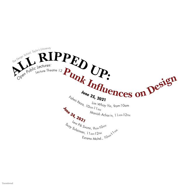
Fig 3.4. Final Transitional System (Week 5 ; 21/5/25)

Fig 3.5. Final Bilateral System (Week 5 ; 21/5/25)

Fig 3.6. Final Modular System (Week 5 ; 21/5/25)

Fig 3.7. Final Dilational System (Week 5 ; 21/5/25)

Fig 3.8. Final Random System (Week 5 ; 21/5/25)
<iframe src="https://drive.google.com/file/d/1VGhRZ-QGuveiJNcCTOAH5lA9AZIb-pQQ/preview" width="640" height="480" allow="autoplay"></iframe>
<iframe src="https://drive.google.com/file/d/10lLSgxQp6anv2EAyNRDUxGM7vfzpFHqI/preview" width="640" height="480" allow="autoplay"></iframe>

Fig 3.9. ORIGINAL EXTRACTED FONT (Week 5 ; 21/5/25)

Fig 3.10. FINAL EXTRACTED FONT (Week 5 ; 21/5/25)

Fig 3.11. REFINING PROCESS (Week 5 ; 21/5/25)

Fig 3.12. BASE REFERENCE FONT (Week 5 ; 21/5/25)

Fig 3.13. FINAL VS ORIGINAL EXTRACTED FONT (Week 5 ; 21/5/25)

Fig 3.14. FINAL MOVIE POSTER (Week 5 ; 21/5/25)
<iframe src="https://drive.google.com/file/d/1Oy_21PwGVOtzH_wWbkMUtzPjbqmzUvi6/preview" width="640" height="480" allow="autoplay"></iframe>
|
| Fig 3.1. Final Axial System (Week 5 ; 21/5/25) |
|
| Fig 3.2. Final Radial System (Week 5 ; 21/5/25) |
|
| Fig 3.3. Final Grid System (Week 5 ; 21/5/25) |
|
| Fig 3.4. Final Transitional System (Week 5 ; 21/5/25) |
|
| Fig 3.5. Final Bilateral System (Week 5 ; 21/5/25) |
|
| Fig 3.6. Final Modular System (Week 5 ; 21/5/25) |
|
| Fig 3.7. Final Dilational System (Week 5 ; 21/5/25) |
|
| Fig 3.8. Final Random System (Week 5 ; 21/5/25) |
<iframe src="https://drive.google.com/file/d/1VGhRZ-QGuveiJNcCTOAH5lA9AZIb-pQQ/preview" width="640" height="480" allow="autoplay"></iframe>
<iframe src="https://drive.google.com/file/d/10lLSgxQp6anv2EAyNRDUxGM7vfzpFHqI/preview" width="640" height="480" allow="autoplay"></iframe>
| |
|
|
| Fig 3.10. FINAL EXTRACTED FONT (Week 5 ; 21/5/25) |
| |
|
| |
|
| |
|
| |
|
<iframe src="https://drive.google.com/file/d/1Oy_21PwGVOtzH_wWbkMUtzPjbqmzUvi6/preview" width="640" height="480" allow="autoplay"></iframe>
Feedbacks
Week 1
General Feedback : Our lecturer briefed us regarding the content of the advanced typography MIB and the rules that is set so we can understand what is expected of us. He also briefed us on what task that we need to complete by next week.
General Feedback : Our lecturer briefed us regarding the content of the advanced typography MIB and the rules that is set so we can understand what is expected of us. He also briefed us on what task that we need to complete by next week.
Week 2
General Feedback : There are too much use of graphic, it is taking away the attention from the title.
Specific Feedback : A few of the system is fine, but most of them uses too much graphic, try to erase the graphic and see if it can stand on it's own. If it's not possible it's just a bad design and needed to be redesigned.
- axial : too much graphic
- radial : too much graphic, and maybe if it doesn't work without the graphic, it just doesn't work
- grid : it's fine
- transitional : it's okay, but you can spread out the information more and it looks a little bit hanging
- bilateral : it's fine
- modular : too much graphic
- dilational : it needs more information management, it's badly managed
- random : it's not random, it needs to be more chaotic.
Week 3
General Feedback : It looks more like splinters rather than glass.
Specific Feedback : Maybe make the crack into one line cutting the letter from the top to bottom, but make it in all kind of directions.
Week 4
General Feedback : There's no problem with the poster. Pay attention to margins.
Specific Feedback : It's okay.
Reflections
Experience :
I was overwhelmed and didn't know where to start. This is also pushed by the fact that I have a pretty bad time management which I am currently trying to fix to little results. I tend to compared my result to my classmates, not in a good way of which trying to find and learn more ways to improve and explore, but more so in the way of them being better and mine being bad which then resulted in me not wanting to try harder. Overall, this task is a little too much for my plate but thankfully I manage to finish it albeit a little late due to myself being confused on what is needed and what is not.
I was overwhelmed and didn't know where to start. This is also pushed by the fact that I have a pretty bad time management which I am currently trying to fix to little results. I tend to compared my result to my classmates, not in a good way of which trying to find and learn more ways to improve and explore, but more so in the way of them being better and mine being bad which then resulted in me not wanting to try harder. Overall, this task is a little too much for my plate but thankfully I manage to finish it albeit a little late due to myself being confused on what is needed and what is not.
Observation :
I thought the font was limiting but from what I have seen, my classmates managed to used all the fonts potential unlike me who limited myself to only using two to three fonts which is a result of not enough exploration. I also observed that even though some people used the same reference, the result differs per person due to how one analyzed and develop it.
Findings :
I should try to explore more options and not limit myself to certain mindset. I find that I can explore much more easier if I don't try too hard to think out of the box and just try what I think would look good and maybe use more variation of style and font rather than sticking to two or three. I also find that I tend to search for an easy way out rather than actually trying to solve it, though this is also due to the fact to the solution I find is usually the most obvious thing in the world.
Further Reading
Week 1 - Typography System
 |
| Fig 3.1. Typographic Design : Form and Communication published by Wiley (Week 5 ; 21/5/25) |
It's a book containing the evolvement of alphabet throughout the centuries. Starting from the origins of writing which were in the form of clay tokens in c. 3150 BCE until the typography in the twentieth century. Along with pictures of the alphabet and typography, there is also historical background stories accompanying the explanation of the pictures.
Week 2 -
 |
| Fig 3.2. How Typography Elevates Design From Good to Great by The Futur (Week 5 ; 21/5/25) |
A youtube video regarding how we could be a great designers in which they mention multiple times on how a good typography creates a great designers, citing examples on how previous design competition winners can utilize typography to their maximum.
Week 3 - Kreativ Beats
 |
| Fig 3.3. Finding Type: A Novel Typographic Exercise by Vinod Nair ((Week 5 ; 21/5/25)) |
A blog by our very own lecturer related to our current task. It contains phase that we need to complete in order to create our extracted typeface along with many examples from former students that did this module.
Week 4 - The Fundamentals of Typography
 |
| Fig 3.4. The Fundamentals of Typography by Gavin and Paul (Week 5 ; 21/5/25) |
 |
| Fig 3.5. Introduction of Type and Language (Week 5 ; 21/5/25) |
This particular part introduces us to basics what and why on the origin of type and language. From the meanings of type to a glimpse of how and why alphabet evolved over time. It also tells us the habit of certain times and how it effects the alphabet they develop.
Comments
Post a Comment