09/06/25 - 16/07/25 ( Week 8 - Week 13 )
Carren Yeliandi / 0376990
Advanced Typography / Bachelors of Design in Creative Media / Taylor's University
Task 3 - Task Exploration & Applications
Carren Yeliandi / 0376990
Advanced Typography / Bachelors of Design in Creative Media / Taylor's University
Task 3 - Task Exploration & Applications
TABLE OF CONTENTS
Lectures
-
Instructions
<iframe
src="https://drive.google.com/file/d/1QDey9mxlxLksXQliAjWr7NJb_BqfRIWe/preview"
width="640" height="480" allow="autoplay"></iframe>
TASK 3A - FONT EXPERIMENT
This task starts by thinking of typeface ideas based on either 3 ways a
Solution, an Expansion or an Experiment. These ideas will then be proposed in
class in presentation form.
Below is my presentation slides containing 3 ideas that I had chosen which I had submitted for feedback.
<iframe src="https://drive.google.com/file/d/1PudiLaslQ4YgdnDOV-6C8hIVcB6mck22/preview" width="640" height="480" allow="autoplay"></iframe>
After the feedback, I went with my first ideas which is based on puzzles.
I first created a puzzle grid based on the reference of a play mat puzzle, as the lecturer suggested to make the puzzle pieces to connect together.
 |
| Fig 3.1.1. First puzzle grid (14/07/25) |
I made this into a 8x8 puzzle grid then deleted the unnecessary parts before combining it using merge. The first letter that I made was A followed by B after which I just deleted the parts that I don't need from the existing letter using knife tool.
 |
| Fig 3.1.2. First letter made (Week 13 | 14/07/25) |
 |
| Fig 3.1.3. Progress 1 (Week 13 | 14/07/25) |
 |
| Fig 3.1.4. First Semi-Finished Font (Week 13 | 14/07/25) |
I personally thought that the puzzle details were too small which I then told the lecturer during the feedback and proceed to make a few variations for confirmation.
 |
| Fig 3.1.5. Puzzle font experiment variations (Week 13 | 14/07/25) |
With the feedback that the lecturer gave me, I made a new grid 6x5 puzzle pieces and made an outline as a puzzle border using merge and then fill in the strokes (size : 5pts).
 |
| Fig 3.1.6. New puzzle grid (Week 13 | 14/07/25) |
I then proceeded to just delete some parts so the negative space will form the letters.
 |
| Fig 3.1.7. Second Semi-Finished Font (Week 13 | 14/07/25) |
I submitted it for feedback before proceeding to finish them all. Here is also the reference used for the connected puzzle font (border + puzzle pieces).
.jpg) | |
|
The lecturers did asked on why the numerals were smaller which was intentional for easy differentiating but either way I tried some more variations but decided to stick to the original but move the number to the middle.
 |
| Fig 3.1.9. FINAL FONT DESIGN (Week 13 | 14/07/25) |
I then used Fontlab 8 free trial to make it into a font. but before that, I filled in the letters stroke and the object > outline stroke > merge to make it into one whole shape.
After everything was done, I just inputted in the Fontlab and insert the kerning as left -34 and right 0 on every letters, numerals and punctuations.
 |
| Fig 3.1.10. FINAL FONTLAB TYPEFACE (Week 13 | 14/07/25) |
<iframe src="https://drive.google.com/file/d/1VPMGoIS4XSMLs_7K5EjnUrEyJUhR99sF/preview" width="640" height="480" allow="autoplay"></iframe>
TASK 3B - FONT PRESENTATION AND APPLICATION
After everything was confirmed, I proceeded with the font presentation and application.
I first planned out everything in text before deciding on a color palette. I decided to try to find a saturated bright summer color palette suitable for childlike items.
 |
| Fig 3.2.1 Color Palette (Week 14 | 22/07/25) |
3B.1. FONT PRESENTATION
I then started to make the font presentation in black and white first in a 1024x1024px art board.
 |
| Fig 3.2.2. Black and White Font Presentation (Week 13 | 14/07/25) |
Slight explanation, starting from the right:
1. A singular letter with size detailing. I used the letter P to symbolize "Puzzle".
2. All letters with some punctuations in a border. To showcase the font.
3. Some paragraphs using the font along with the font family name. To showcase how it looks when used in sentences.
Paragraphs are taken from ChatGPT with the prompt of "The impact of puzzles for children."
4. "I AM PUZZLED?" in a border with random flying puzzle pieces.
5. Game like game over text with puzzles line on the top and bottom.
After everything was done, I proceeded to insert the colors from the color palette with the addition of black and white for contrast.
 | |
|
Starting from the right,
1. Size Details
 | |
|
Explanations :
- Attempted use of color for the background became too overpowering and not visible, hence the black background.
- The letter P uses the turquoise color with white infill that is made by dividing a blank box with the letter P.
- The lines for the size details are yellow for visibility and brightness with white text in the same puzzle font for the size details texts.
2. Font
 |
| Fig 3.2.5. Typeface Font Presentation (Week 13 | 15/07/25) |
Explanations :
- Every letter will each be different color with alternation from red > orange > yellow > green > blue. repeat it until the end.
- the border has a white fill both on the inside and the stroke.
- the background is also black for contrast.
3. Paragraph
 |
| Fig 3.2.6. Paragraphs Font Presentation (Week 13 | 15/07/25) |
Explanations :
- Different colors for each texts and items.
- White background for contrast.
4. Text
 |
| Fig 3.2.7. One Liner Font Presentation (Week 13 | 15/07/25) |
Explanations :
- Use of gradients on the puzzle border for a dynamic look.
- Texts and puzzle pieces are white for an unfilled puzzle look. The text has green outline to fill in the gap.
5. Game
 |
| Fig 3.2.8. Game Font Presentation (Week 13 | 15/07/25) |
Explanations :
- game over text and the puzzles are red. but due to the placement it looks like the puzzle border is white with red background when in fact it's the opposite.
<iframe src="https://drive.google.com/file/d/1HEPtYRvG-DeUm6_7vx5kCMj5p6TlUILu/preview" width="640" height="480" allow="autoplay"></iframe>
3B.2. FONT APPLICATION
I made the pattern alongside with the presentation.
I basically used a fun game-like theme with the unaligned texts and flying/falling puzzles pieces scattered with mountains of connected puzzle pieces like Tetris. All of which are made using the bright color palette chosen earlier. Some of which are even using different colors per items in one application to showcase the fun and bright puzzle pieces in the application.
 |
| Fig 3.2.9. Pattern Making 1 (Week 13 | 15/07/25) |
 |
| Fig 3.2.10. Pattern Making 2 (Week 13 | 15/07/25) |
 |
| Fig 3.2.10. Application Process (Week 13 | 17/07/25) |
1. Children's Shirt
(Design : Multi-colored unaligned puzzle pieces + Scattered flying puzzle pieces + A Tetris stack of connected puzzle)
 |
| Fig 3.2.12. Font Application 1 (Week 13 | 15/07/25) |
2. Puzzle Box
(Design : Unaligned puzzle pieces & Cyan Scattered flying puzzle pieces + Cyan A Tetris stack of connected puzzle both on the front and on the side, the side having a slight cyan gradient)
 |
| Fig 3.2.13. Font Application 2 (Week 13 | 15/07/25) |
3. Stickers
(Design : Stacked multicolored puzzle pieces + connected font)
 |
| Fig 3.2.14. Font Application 3 (Week 13 | 15/07/25) |
3. Bottles
(Design : Unaligned puzzle pieces on a gradient of the color palette)
 |
| Fig 3.2.15. Font Application 4 (Week 13 | 15/07/25) |
5. Honor Time Clock
(Main color : cyan and white , Design : Puzzle font clock + Scattered flying puzzle pieces + A Tetris stack of connected puzzle)
 |
| Fig 3.2.16. Font Application 5 (Week 13 | 15/07/25) |
<iframe src="https://drive.google.com/file/d/1Lb9klS39_Y7VdrqJwpaTxJKIDAOW2p2_/preview" width="640" height="480" allow="autoplay"></iframe>
TASK 3C - HONOR TALENTS
 |
| Fig 3.3.1. Honor Talents All Designs (Week 14 | 22/07/25) |
I used the design from the font application 5 but changed it accordingly to what I need. The background are extracted for the backdrop and is then darkened by adding a low opacity black mask layer and lowering the opacity of the background slightly.
 |
| Fig 3.3.2. Honor Talents Background Design (Week 14 | 22/07/25) |
The title showcase is simply the backdrop but in actual opacity and brightness + black up and down connected puzzle pieces in the word "PUZZLE".
 |
| Fig 3.3.3. Honor Talents Title Showcase Design (Week 14 | 22/07/25) |
The time on the phone is simply using the border and time on the application just enlarged and added dates + battery percentage. The animation is simple, the colon blinking to symbolize the passing of time and the puzzle moving to show the change of time. The backdrop had some simple puzzle dropping animation just to add more motion.
 |
| Fig 3.3.4. Honor Talents Time and Animation Design (Week 14 | 22/07/25) |
It is only after I finished that I realized that the participation guide that I have been reading and creating the design based on is from 2024, the 2025 competition has no standby category which throws off my plans completely. I still submitted it, just under a similar but different category (Theme).
| Fig 3.3.5. Additional Icon Designs (Week 14 | 22/07/25) |
 |
| Fig 3.3.6. Proof of Submission (Week 14 | 22/07/25) |
TASK 3 FINAL COMPILATION
|
| Fig 3.4.1. FINAL FONTLAB TYPEFACE (Week 13 | 15/07/25) |
<iframe src="https://drive.google.com/file/d/1VPMGoIS4XSMLs_7K5EjnUrEyJUhR99sF/preview" width="640" height="480" allow="autoplay"></iframe>
 |
| Fig 3.4.2. FONT PRESENTATION 1 (Week 13 | 15/07/25) |
 |
| Fig 3.4.3. FONT PRESENTATION 2 (Week 13 | 15/07/25) |
 |
| Fig 3.4.4. FONT PRESENTATION 3 (Week 13 | 15/07/25) |
 |
| Fig 3.4.5. FONT PRESENTATION 4 (Week 13 | 15/07/25) |
 |
| Fig 3.4.6. FONT PRESENTATION 5 (Week 13 | 15/07/25) |
<iframe src="https://drive.google.com/file/d/1HEPtYRvG-DeUm6_7vx5kCMj5p6TlUILu/preview" width="640" height="480" allow="autoplay"></iframe>
 |
| Fig 3.4.7. FONT APPLICATION 1 (Week 13 | 15/07/25) |
 |
| Fig 3.4.8. FONT APPLICATION 2 (Week 13 | 15/07/25) |
 |
| Fig 3.4.9. FONT APPLICATION 3 (Week 13 | 15/07/25) |
 |
| Fig 3.4.10. FONT APPLICATION 4 (Week 13 | 15/07/25) |
 |
| Fig 3.4.11. FONT APPLICATION 5 (Week 13 | 15/07/25) |
<iframe src="https://drive.google.com/file/d/1Lb9klS39_Y7VdrqJwpaTxJKIDAOW2p2_/preview" width="640" height="480" allow="autoplay"></iframe>
Observation :
Everyone is so creative and put so much effort into their work to make it looks cool and elegant to the point that I just feel like I didn't do well enough which is probably true. There's a lot of cool font made by others that I had seen though, the presentation and applications are simple yet somehow they made it looked really cool and elegant that I wish I know how to do it like them...
Findings :
I find that I am weak in pattern making for mock up due to the font application and event the font presentation. It's not necessarily horrible, two out of five is great actually, one is okay but the other 2 is debatable but simple and acceptable for me.
Week 10
This chapter tells us about fonts, specifically about the two types of fonts, outline and bitmapped. Bitmapped fonts were the most easiest way for computer to generate fonts as digital devices usually creating images using dots (bitmaps) which is what they did for fonts (bitmapped fonts).
This chapter tells us about fonts, specifically TrueType Font (TTF). TrueType fonts are made after the PostScript but before OTF. It offers a larger range of characters compared to PostScript and a higher quality of fonts due to the clear instructions called "hinting". While some people still uses TTF, most of them has moved to using OTF.
This chapter tells us about fonts, specifically about OpenType Fonts (OTF). Open type fonts are in a sense a combination of both TrueType font and Post-script fonts. Both types can be inserted into OTF but since OTF has such a wide range, you will never know how the OTF looks like if you never tried it as it can range up to 65000 characters.
|
| Fig 3.4.12. Proof of Submission (Week 14 | 22/07/25) |
Feedbacks
Week 9
General Feedback : Idea 2 is fine but idea 1 is better.
General Feedback : Idea 2 is fine but idea 1 is better.
Specific Feedback : Idea 1 could work if you create a unicase letters, using a singular base and developing it into an alphabet. For example, one side has an intrusion and the other has the extrusion, so they will actually complete each other.
Week 10
General Feedback : Combine the two ideas together.
General Feedback : Combine the two ideas together.
Specific Feedback : Create variations and show them to me. Make the puzzle shapes larger and more visible. Combine both the negative space variation and the lesser but bigger puzzle pieces together.
Week 11
General Feedback : Finish the punctuations
General Feedback : Finish the punctuations
Specific Feedback : Finish the punctuations and finalized your font today so next week can immediately present.
Week 12
General Feedback : Continue with your presentation and application.
General Feedback : Continue with your presentation and application.
Specific Feedback : You can proceed to do your presentation and application, actual puzzles and children's book won't work but you can try making a box for the puzzle or stickers and maybe even a shirt.
Week 13
General Feedback : It looks interesting.
General Feedback : It looks interesting.
Specific Feedback : It looks interesting, it's more interesting for the font presentation to be in paragraphs like the third one. If you're not satisfied with the current one, you still have time to change it.
Reflections
Experience :
It was very overwhelming in the beginning and I was doubting if I could even finish this in time with a satisfactory results. However, as time goes on, I realized it wasn't as bad as I made it out to be, yes I do have bad time management but it is still manageable with everything. It just that I don't know if I could get a good score from this task due to how simple and childish it the font presentation and application looked. It is a font made with a children play mat in mind so I guess that should be fine but it's still a bit worrying. Overall, this task was not as overwhelming as I thought but I don't think I want to do it again...
It was very overwhelming in the beginning and I was doubting if I could even finish this in time with a satisfactory results. However, as time goes on, I realized it wasn't as bad as I made it out to be, yes I do have bad time management but it is still manageable with everything. It just that I don't know if I could get a good score from this task due to how simple and childish it the font presentation and application looked. It is a font made with a children play mat in mind so I guess that should be fine but it's still a bit worrying. Overall, this task was not as overwhelming as I thought but I don't think I want to do it again...
Observation :
Everyone is so creative and put so much effort into their work to make it looks cool and elegant to the point that I just feel like I didn't do well enough which is probably true. There's a lot of cool font made by others that I had seen though, the presentation and applications are simple yet somehow they made it looked really cool and elegant that I wish I know how to do it like them...
Findings :
I find that I am weak in pattern making for mock up due to the font application and event the font presentation. It's not necessarily horrible, two out of five is great actually, one is okay but the other 2 is debatable but simple and acceptable for me.
Further Reading
Week 9
 |
| Fig 5.1. Book Cover (Week 9 | 19/06/25) |
 |
| Fig 5.2. "What is a Font ?" book chapter (Week 9 | 19/06/25) |
This chapter tells us about fonts, specifically what is contain in a font and what's important to note about it.
 |
| Fig 5.3. "Type of Fonts" book chapter (Week 10 | 26/06/25) |
This chapter tells us about fonts, specifically about the two types of fonts, outline and bitmapped. Bitmapped fonts were the most easiest way for computer to generate fonts as digital devices usually creating images using dots (bitmaps) which is what they did for fonts (bitmapped fonts).
In smaller size, bitmapped fonts will appear normal but if enlarged, you will be able to see the dots which is why they need different set of bitmapped fonts for different type size. The solution given for this is to use an outline font, which stores shapes kind of like a vector.
Week 11
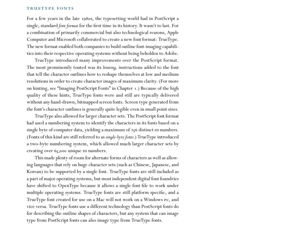 |
| Fig 5.4. "TTF" book chapter (Week 11 | 05/07/25) |
This chapter tells us about fonts, specifically TrueType Font (TTF). TrueType fonts are made after the PostScript but before OTF. It offers a larger range of characters compared to PostScript and a higher quality of fonts due to the clear instructions called "hinting". While some people still uses TTF, most of them has moved to using OTF.
Week 12
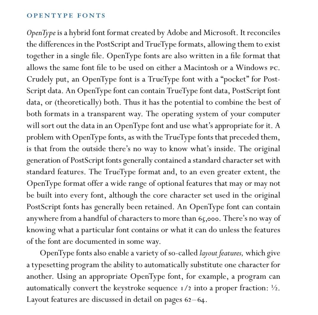 |
| Fig 5.5. "OTF" book chapter (Week 12 | 10/07/25) |
This chapter tells us about fonts, specifically about OpenType Fonts (OTF). Open type fonts are in a sense a combination of both TrueType font and Post-script fonts. Both types can be inserted into OTF but since OTF has such a wide range, you will never know how the OTF looks like if you never tried it as it can range up to 65000 characters.
Comments
Post a Comment